
Preview image. Unlock full-res
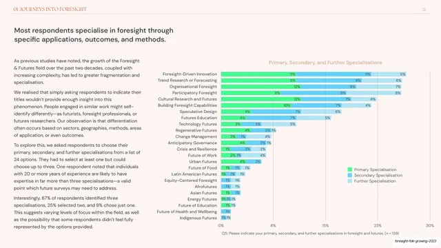
Appendix horizontal stacked bar chart ranking the least important motivations across nine rows in two blues on a cream ground.
Summary
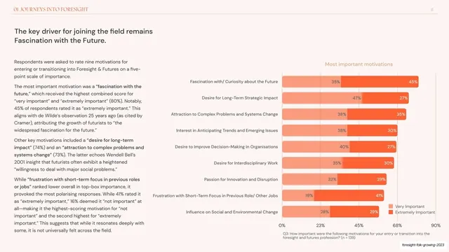
An appendix data slide: a right-anchored horizontal stacked bar chart ranking nine motivations by how unimportant respondents rated them, split into "Slightly Important" and "Not Important" segments in two blues.
Visual description
Pale warm-cream background. The "APPENDIX" running header and page number "56" sit on a hairline rule at the top. A two-line salmon/coral title ("Least important motivations / All respondents") is centered over the chart. Nine right-aligned row labels run down the left edge (Frustration with Short-Term Focus, Influence on Social and Environmental Change, Desire for Interdisciplinary Work, and so on). Each row is a horizontal stacked bar growing rightward from a baseline, split into a light-blue "Slightly Important" segment and a darker-blue "Not Important" segment, each carrying an inline percentage label. The bars descend in length top to bottom (16 percent down to 2 percent for the Not Important segment). A small two-row legend sits lower-right; a grey caption line states the question and sample (n = 139). A faint vertical gridline scale runs 0 to 30 percent along the bottom.
Key takeaway
Sorting the rows longest-to-shortest so the ranking is legible before you read a single number, and stacking only two related segments per bar to keep it scannable. Inline value labels on every segment remove the need to consult the axis.
Reuse notes
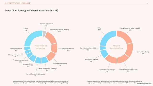
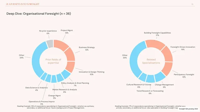
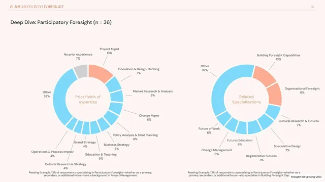
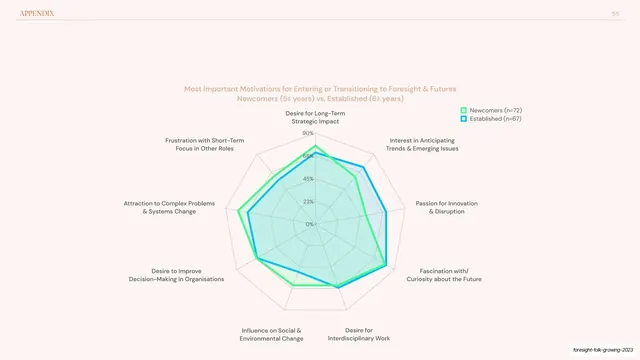
A solid pattern for any "ranked items, two sub-categories" data slide in a report appendix. Two-segment stacks are the practical limit before stacked bars get hard to compare; for more series switch to grouped bars. Pairs naturally with the radar and donut slides in this same appendix run.
From this deck: Least important motivations stacked bar chart
View deck


















More like this








Keep what you find
A free account saves references to boards and can send you a weekly email of picks based on what you save.
To see every result, go Pro.