Preview image. Unlock full-res
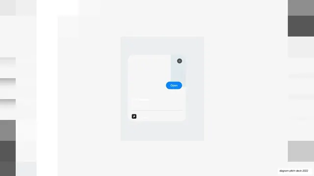
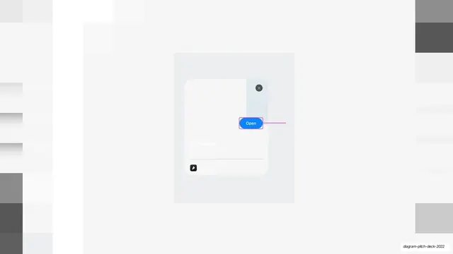
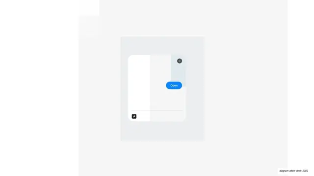
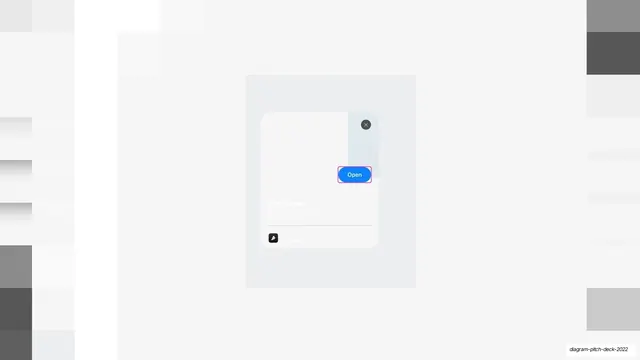
The same faded plugin clip modal, now with the blue Open button wrapped in a pink Figma selection outline.
Summary
The same low-contrast plugin clip modal as before, with the bright blue "Open" button now wrapped in a thin pink Figma selection box to single it out.
Visual description
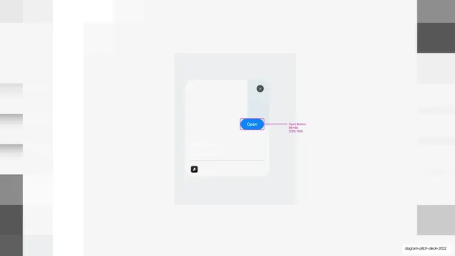
The layout repeats the prior slide: a mostly white field with faint soft gray placeholder columns dimmed at the far edges, and a centered light gray panel holding a white modal card. The card carries the dark close (x) button, the faded "Clip Name" label and meta lines, a hairline rule, and a small dark icon button. The blue (#2E8AF0) "Open" pill overlaps the card's right edge, and here it is bracketed by a thin pink-magenta Figma selection outline marking it as the chosen element.
Key takeaway
Advancing a feature walkthrough by adding only a selection outline to the already-highlighted button makes the progression read clearly: first spotlight the control, then show it being selected. Tiny incremental changes across near-identical slides create a built-in sense of motion.
Reuse notes
The middle frame of a three-slide reveal sequence; it follows the faded-modal slide and precedes the annotated one. The Figma selection chrome only suits a design-tool deck. Keep the surrounding layout pixel-identical to its siblings so the one change stands out.
From this deck: Plugin clip modal with selected button
View deck