Preview image. Unlock full-res
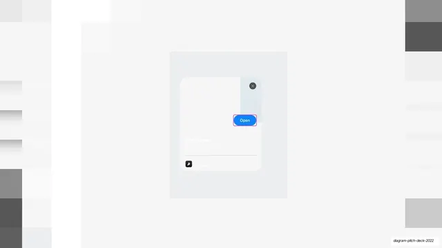
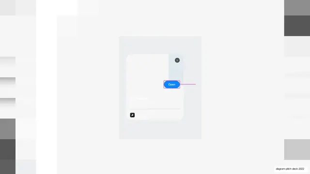
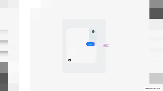
A near-empty App Clip card frame with white placeholder panels and a blue Open button, shown as a blank starting template.
Summary
The App Clip card shown as a stripped-down blank scaffold: white and pale-gray placeholder blocks, a dismiss circle, a "Powered by" chip, and the blue Open button, with content removed.
Visual description
On pale gray a soft rounded panel holds an App Clip card reduced to empty structure, a tall white column on the left, lighter gray blocks filling the rest, a dark circular close button top-right, a faint hairline divider low in the card, and a small dark "Powered by" chip bottom-left. The blue "Open" pill sits at right, overlapping the divide. With the photo, title, and copy all blanked, the slide reads as the empty template that other slides fill in.
Key takeaway
Showing a component as a bare placeholder frame conveys "this is the reusable scaffold" and sets up before/after comparisons. Keeping only the structural blocks plus the one blue action keeps the empty state legible rather than confusing.
Reuse notes
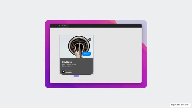
Use as the "starting point" or empty-template beat in a process or product sequence, especially preceding a filled-in version. The retained Open button and Powered-by chip keep it recognizable as the same component. Pairs with the completed card slides earlier in this deck.
From this deck: App Clip card blank-state mockup
View deck