Preview image. Unlock full-res
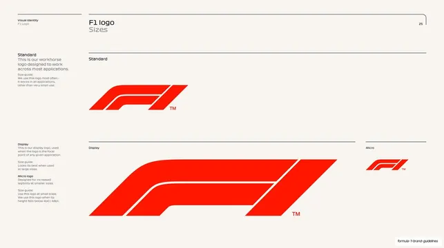
Logo-sizing page on cream comparing the three F1 logo cuts (Standard, Display, Micro) at their relative scales with usage notes for each.
Summary
The logo-sizing overview: the three F1 logo cuts (Standard, Display, Micro) shown together at their intended relative scales, each with a short size guide.
Visual description
Cream (#F7F3EC) page with the running header ("Visual Identity, F1 Logo", "F1 logo / Sizes", page 25) and the corner bracket. The left column carries grouped notes: "Standard" with a workhorse description, then "Display" and "Micro" guidance further down. The right area is split by hairline rules into labelled zones: a "Standard" red F1 mark sits at upper-mid scale; below, a much larger "Display" version of the mark stretches wide across the band; and a small "Micro" version sits in a narrow column at far right. All three are the red F1 streamline mark with a small "TM". The relative sizing communicates which cut is meant for which scale.
Key takeaway
Showing all logo variants on one page at their true relative sizes, rather than each isolated, so the reader instantly understands the hierarchy (big = Display, default = Standard, tiny = Micro). The hairline-divided zones keep three different scales legible side by side.
Reuse notes
A good single-page summary for any logo that ships in multiple size-optimised cuts. Best placed before the per-cut detail pages (construction, clear space, applications). Relies on a logo system that genuinely has distinct size variants.
From this deck: F1 logo sizes (Standard, Display, Micro)
View deck



































More like this


Keep what you find
A free account saves references to boards and can send you a weekly email of picks based on what you save.
To see every result, go Pro.