
Preview image. Unlock full-res
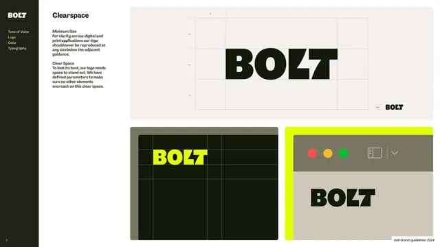
Clear-space spec showing the horizontal and vertical lockups with dashed exclusion boxes and lilac measurement modules around each mark.
Summary
A clear-space page defining the exclusion zone around each lockup, with dashed boundary boxes and pale lilac measurement modules keyed to the width of the Nexus shapes.
Visual description
Two-column layout, heading "Logo Clear Space" over copy that defines the minimum clear space as the width of the Nexus (horizontal) or one Nexus shape (vertical). The right rounded off-white panel holds the horizontal lockup centered up top and the vertical lockup centered below. Each mark is framed by a thin dashed rectangle marking the exclusion zone, with pale lilac square modules (each carrying a small "x" label) tucked into the corners and edges to show the spacing unit derived from the icon. The cobalt/poppy/black Nexus reads clearly against the warm ground.
Key takeaway
Deriving the clear-space unit from the logo's own geometry (a Nexus shape) and visualizing it with tinted "x" modules plus a dashed box, so the rule is self-documenting and scales with the mark.
Reuse notes
A direct template for the clear-space page in any logo guideline. The "measure from the mark's own parts" approach travels to almost any identity. Keep the modules a quiet tint so they read as guides, not as part of the logo.
From this deck: Docusign logo clear space
View deck




































































































More like this








Keep what you find
A free account saves references to boards and can send you a weekly email of picks based on what you save.
To see every result, go Pro.