Preview image. Unlock full-res
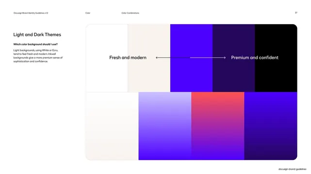
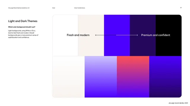
Light page mapping a left-to-right "fresh and modern" to "premium and confident" spectrum across solid and gradient color bands with a double-headed arrow.
Summary
A theme-selection page that lays out backgrounds on a left-to-right mood axis, from light "fresh and modern" to dark "premium and confident", using paired rows of solid and gradient color bands.
Visual description
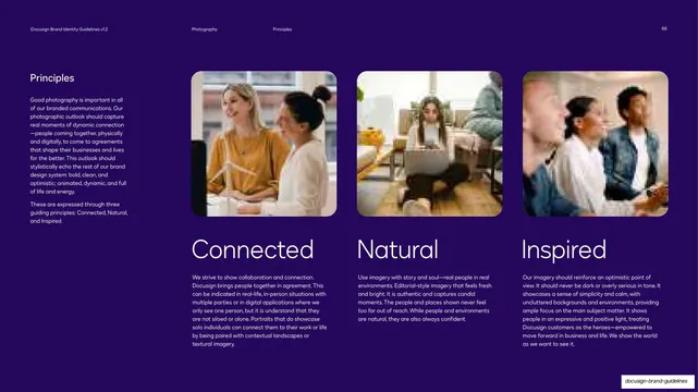
White background with the standard three-zone header ("Color" / "Color Combinations", page "37"). The left column holds "Light and Dark Themes", a bold question "Which color background should I use?", and a short paragraph. The right two-thirds is a large rounded panel split into two horizontal rows of color bands. The top row steps from white and ecru on the left through bright cobalt and deep violet to pure black on the right; the bottom row mirrors it with the gradient equivalents (a near-white, a lilac-to-cobalt, a poppy-to-violet, and a cobalt-to-deep-violet). A horizontal double-headed arrow runs across the middle, with "Fresh and modern" labeled over the light end (dark text) and "Premium and confident" over the dark end (light text), so the spectrum doubles as a mood scale.
Key takeaway
Framing a palette as a continuous mood axis rather than a flat list: arranging backgrounds light-to-dark under a single labeled arrow turns "which background do I pick" into an intuitive position-on-a-scale decision. Pairing each solid band with its gradient twin shows both options at the same temperature.
Reuse notes
A useful page for any system that ships both light and dark themes and wants to give designers a feel for the emotional register of each end. The arrow-axis device generalizes to other either-or brand decisions. Depends on a palette that genuinely spans light to dark.
From this deck: Light and dark theme spectrum
View deck





















More like this



Keep what you find
A free account saves references to boards and can send you a weekly email of picks based on what you save.
To see every result, go Pro.