GitHub 2026 Brand Guidelines
GitHub's 89-page 2026 brand guidelines covering the Invertocat logo, sub-brand architecture, GitHub Green color system, the Mona/Copilot mascots, 3D isometric illustration, the contribution-graph motif, Mona Sans typography, and event design.
89 slides · Guideline
View deck overview
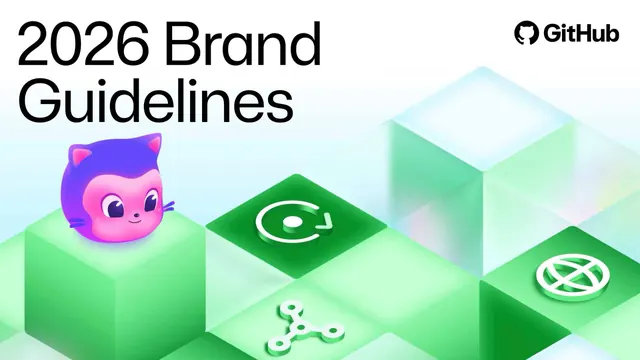
GitHub 2026 Brand Guidelines cover

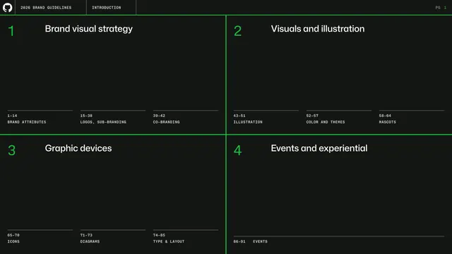
Table of contents quadrant grid

Brand Attributes section divider

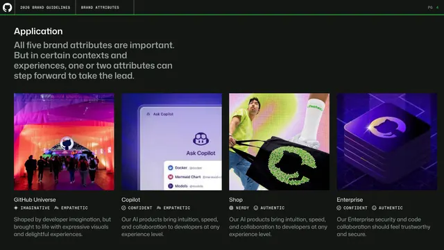
Brand attributes in application (four cards)

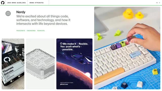
Nerdy attribute mood board

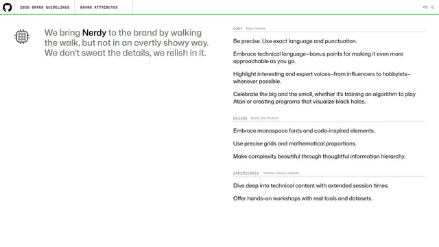
Nerdy attribute in copy, design, experiences

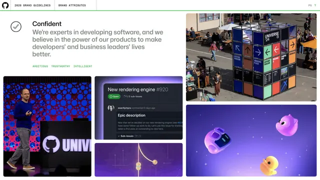
Confident attribute mood board

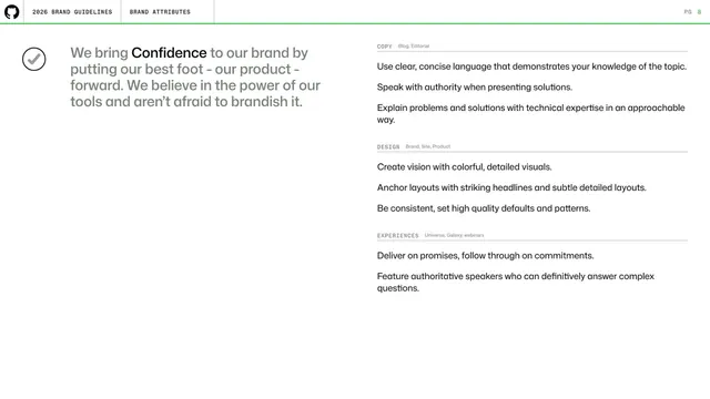
Confident attribute in copy, design, experiences

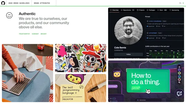
Authentic attribute mood board

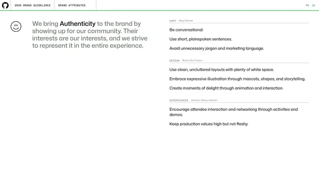
Authentic attribute in copy, design, experiences

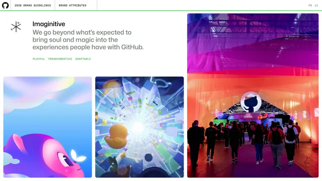
Imaginative attribute mood board

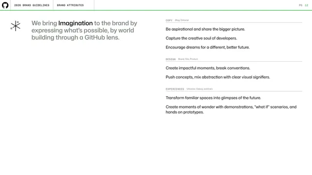
Imaginative attribute in copy, design, experiences

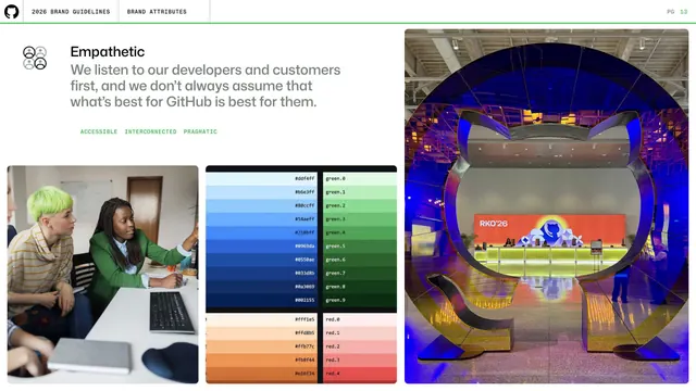
Empathetic attribute mood board

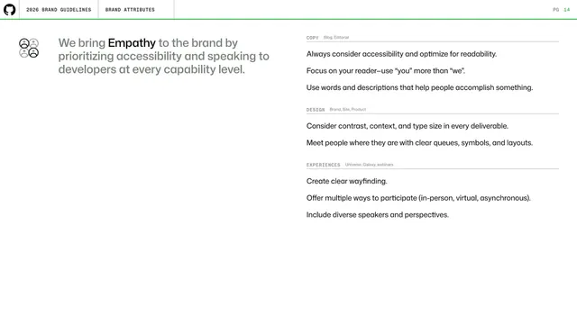
Empathetic attribute in copy, design, experiences

Logo section divider

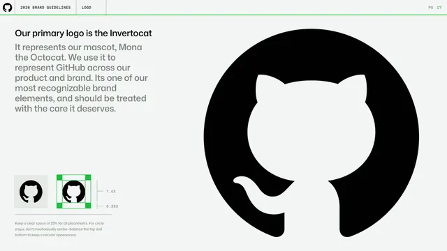
Primary logo, the Invertocat

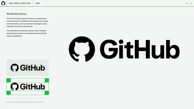
Wordmark lockup

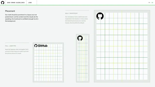
Logo placement and grids

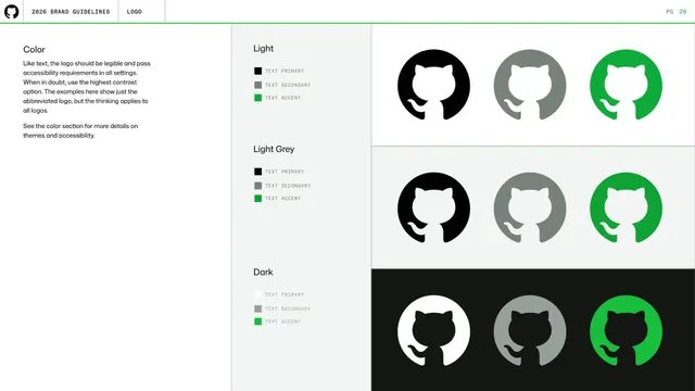
Logo color across themes

Logo color theme blocks

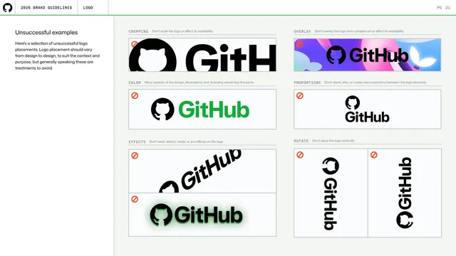
Logo unsuccessful examples (do-not grid)

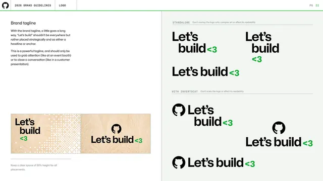
Brand tagline "Let's build

Sub-branding section divider

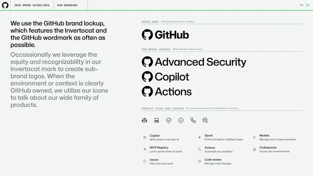
Sub-branding lockups and product icons

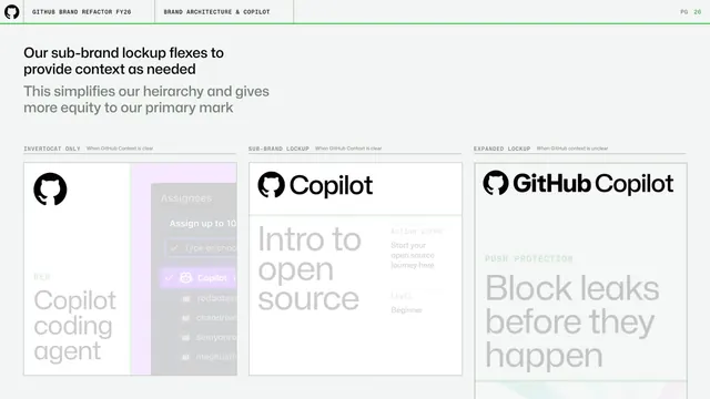
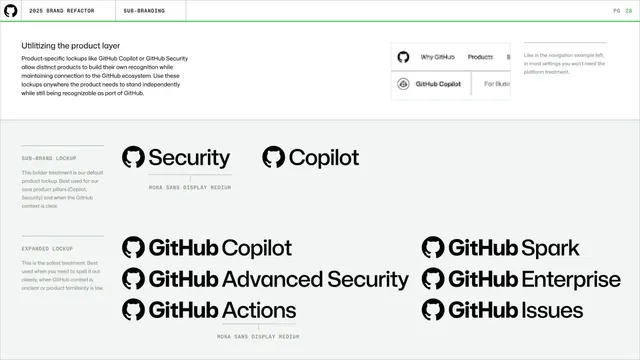
Sub-brand lockup flexing for context

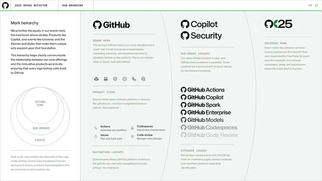
Mark hierarchy (core, sub-brands, events)

Mark hierarchy detail columns

Utilizing the product layer

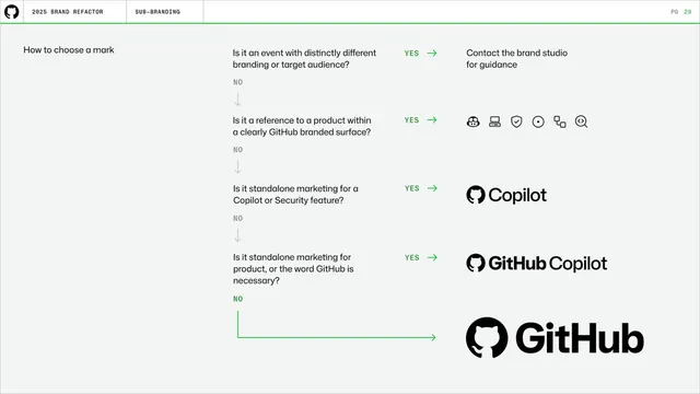
How to choose a mark (decision flow)

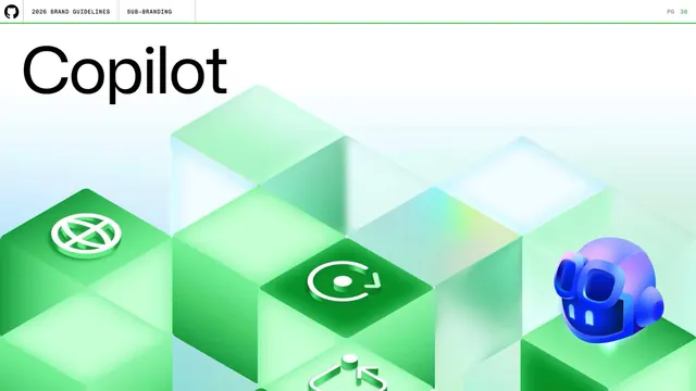
Copilot sub-brand divider

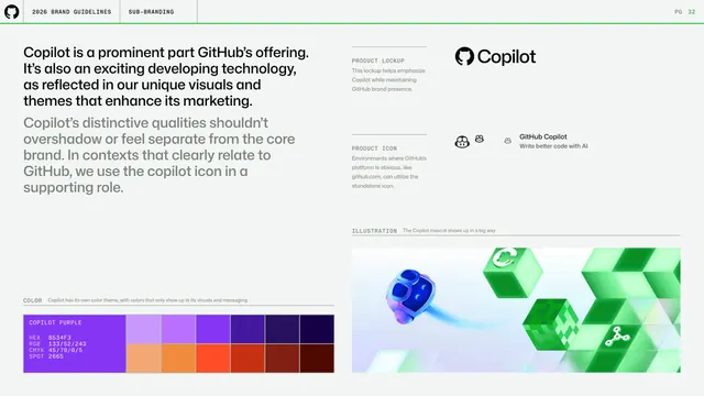
Copilot color theme and dithering

Copilot product lockup, icon, and color

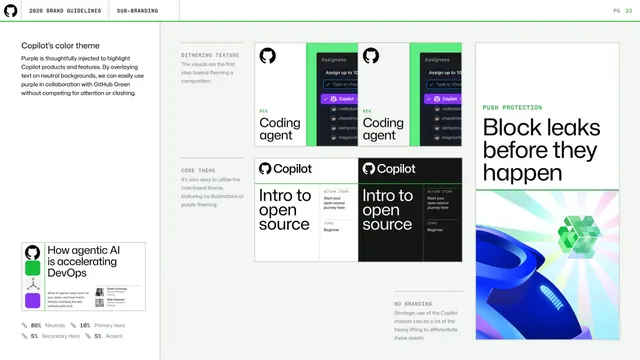
Copilot color theme applications

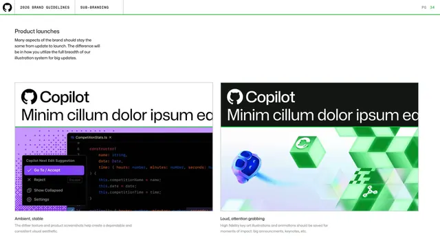
Copilot product launch loudness

Security sub-brand divider

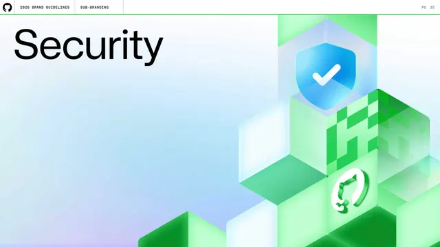
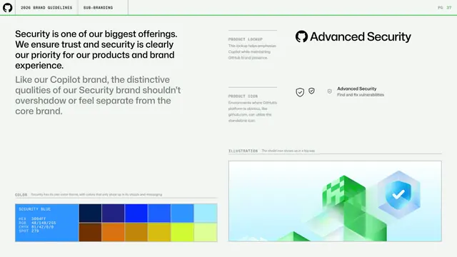
Security product lockup, icon, and color

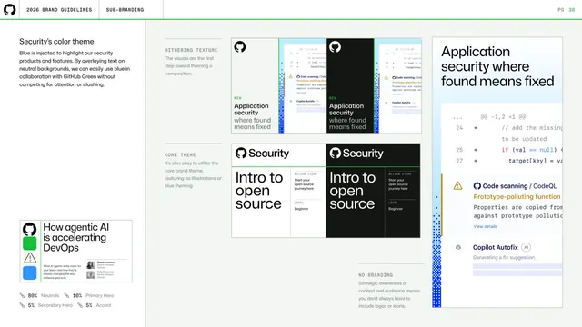
Security color theme applications

Co-branding section divider

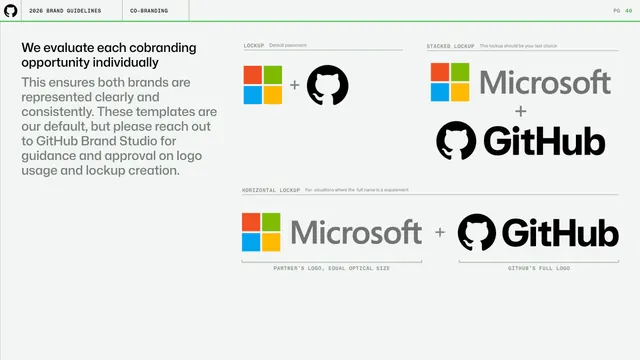
Co-branding lockups with Microsoft

Co-branding lockups detail

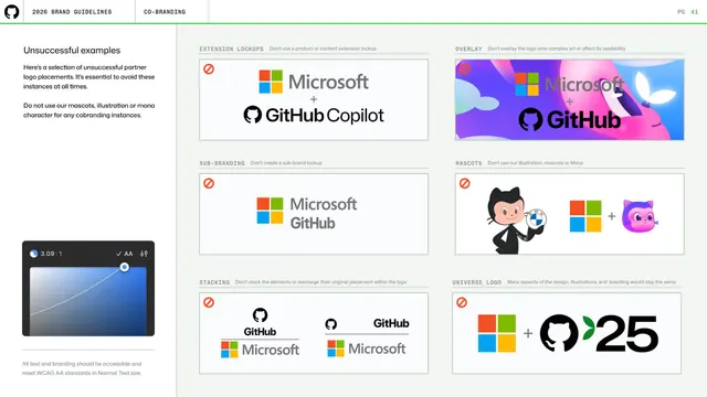
Co-branding unsuccessful examples

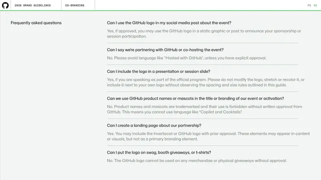
Co-branding frequently asked questions

Illustration section divider

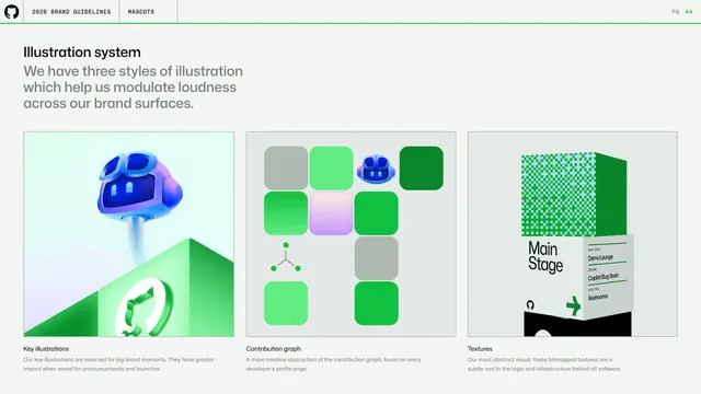
Illustration system three styles

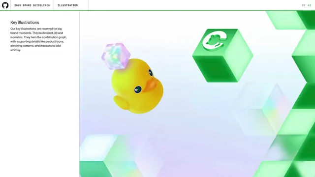
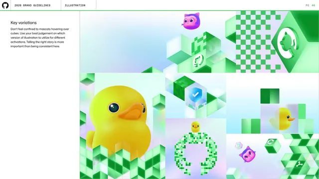
Key illustrations detail

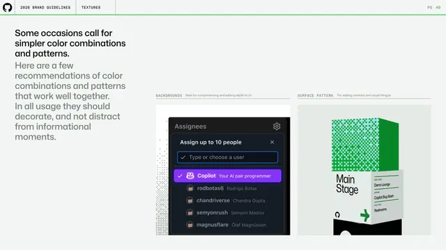
GitHub guidelines - simpler texture combinations

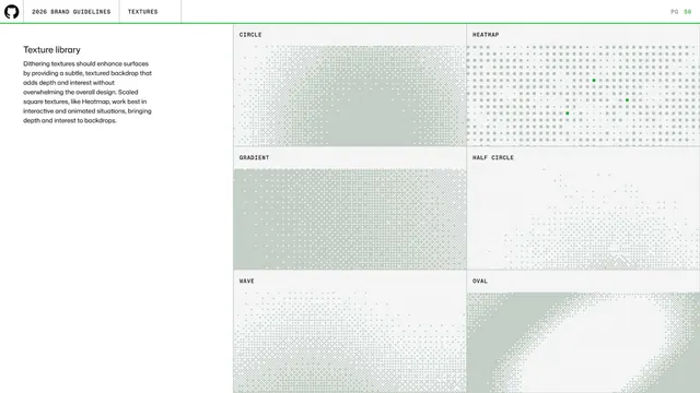
GitHub guidelines - texture library grid

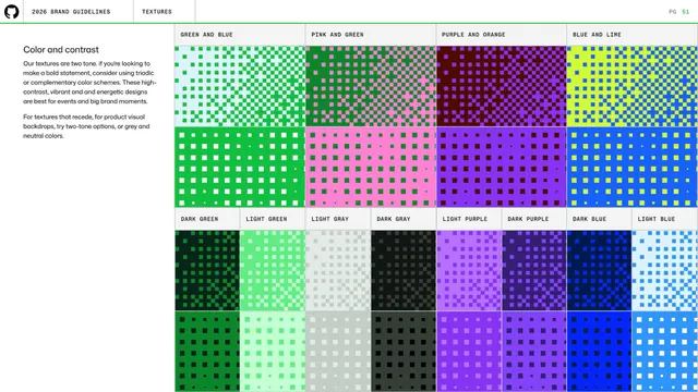
GitHub guidelines - texture color and contrast

GitHub guidelines - Color section divider

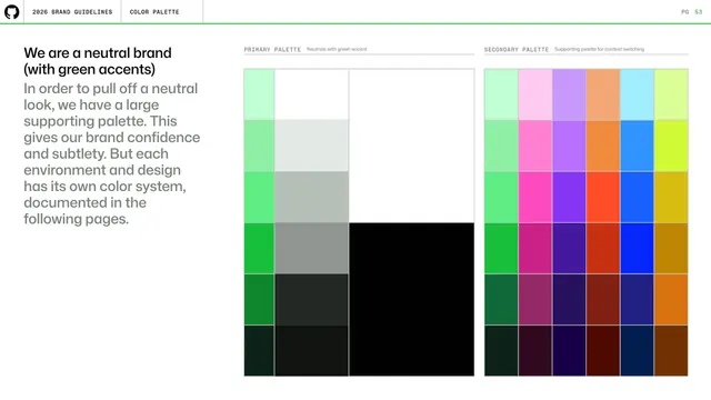
GitHub guidelines - neutral brand color intro

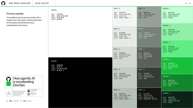
GitHub guidelines - primary palette specs

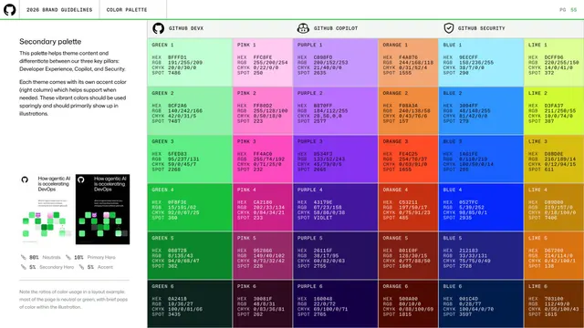
GitHub guidelines - secondary palette by pillar

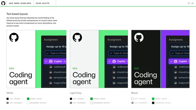
GitHub guidelines - text-based layout themes

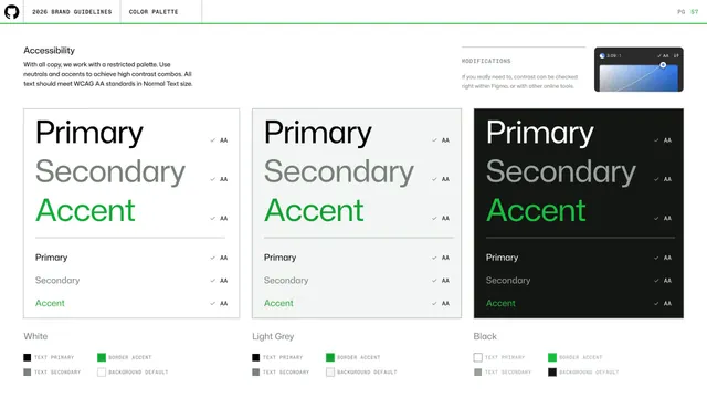
GitHub guidelines - color accessibility

GitHub guidelines - Mascots section divider

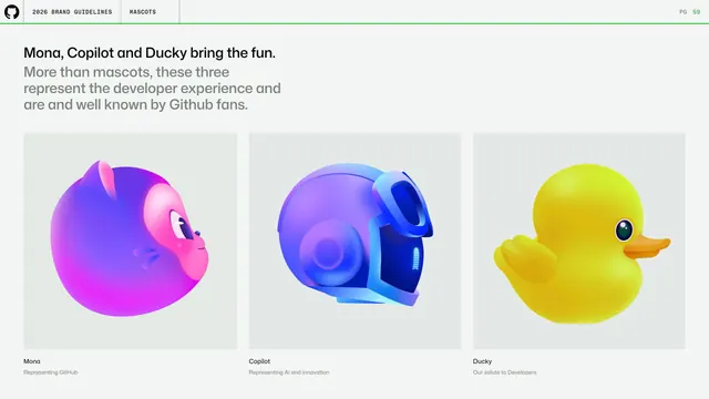
GitHub guidelines - meet the mascots

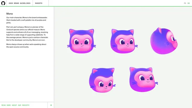
GitHub guidelines - Mona character sheet

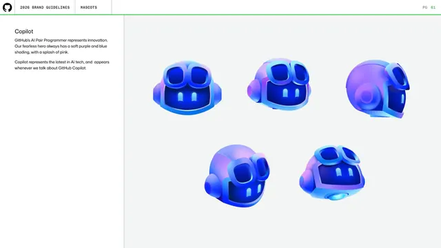
GitHub guidelines - Copilot character sheet

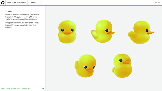
GitHub guidelines - Duckie character sheet

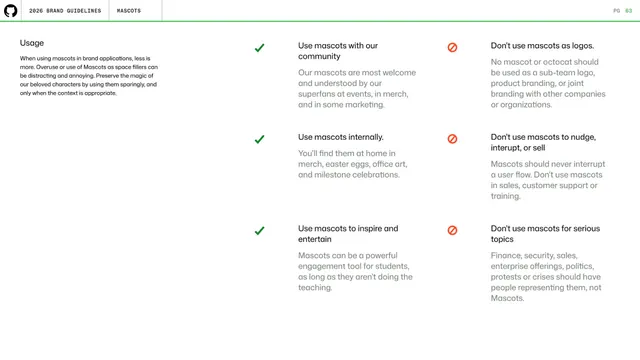
GitHub guidelines - mascot usage do and don't

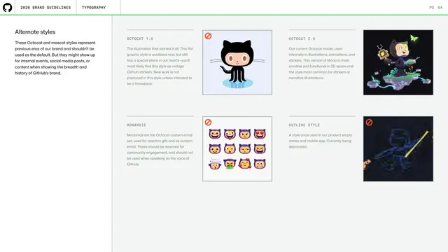
GitHub guidelines - alternate mascot styles

GitHub guidelines - Icons section divider

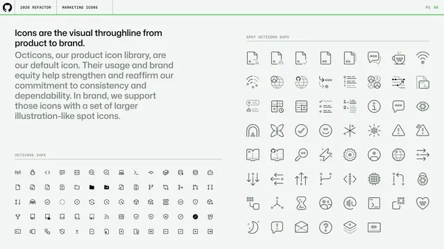
GitHub guidelines - icons as visual throughline

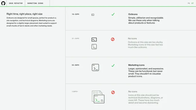
GitHub guidelines - icon size selection

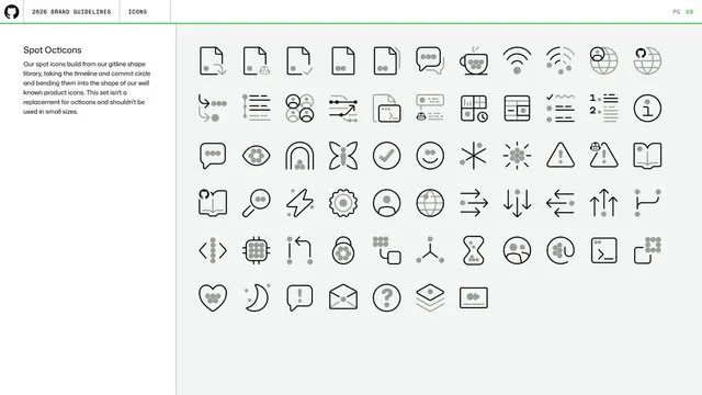
GitHub guidelines - spot Octicons grid

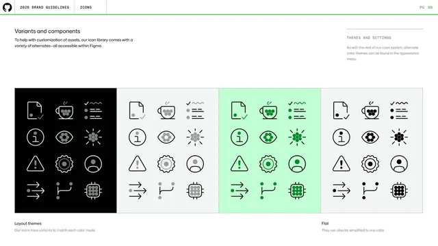
GitHub guidelines - icon variants and themes

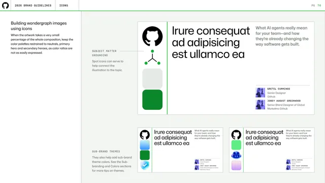
GitHub guidelines - building wondergraph images

GitHub guidelines - Diagrams section divider

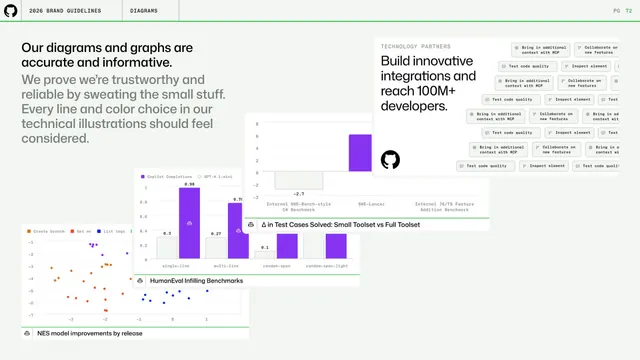
GitHub guidelines - accurate diagrams and graphs

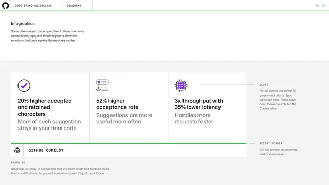
GitHub guidelines - infographics with icons and type

GitHub guidelines - Typography section divider

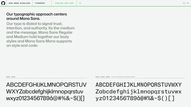
GitHub guidelines - Mona Sans typography intro

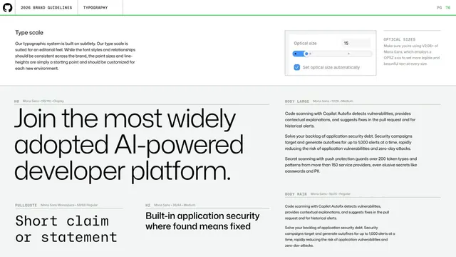
GitHub guidelines - type scale

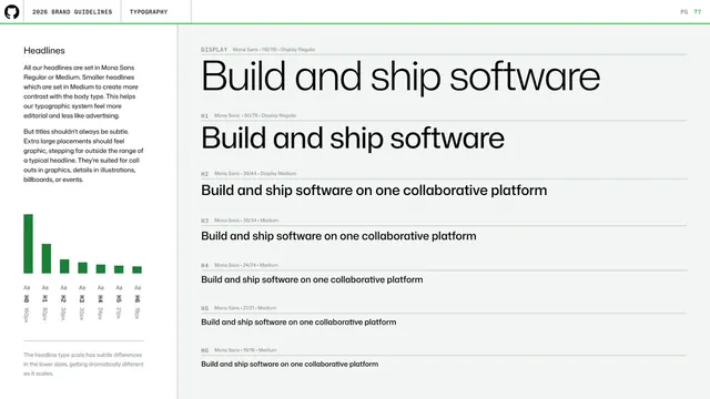
GitHub guidelines - headline type scale

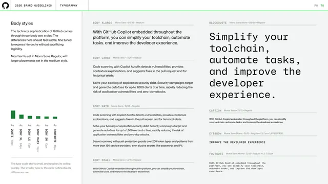
GitHub guidelines - body type styles

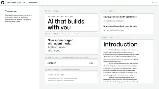
GitHub guidelines - type pairing

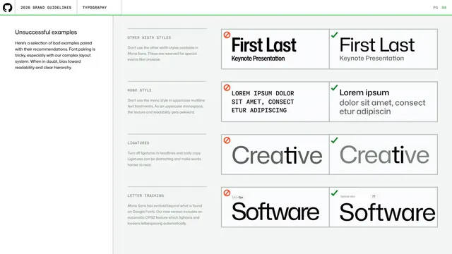
GitHub guidelines - type pairing mistakes

GitHub guidelines - Layout section divider

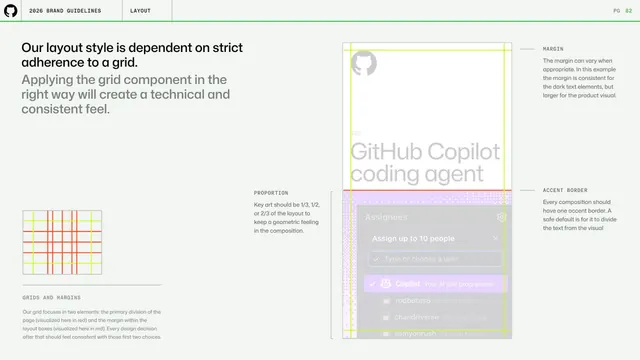
GitHub guidelines - grid and margins

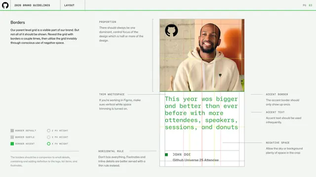
GitHub guidelines - borders and negative space

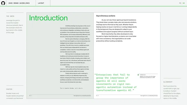
GitHub guidelines - grid-revealed editorial spread

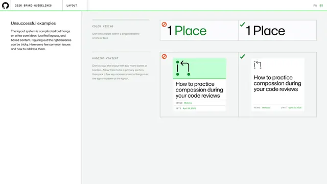
GitHub guidelines - layout mistakes

GitHub guidelines - Experiential section divider

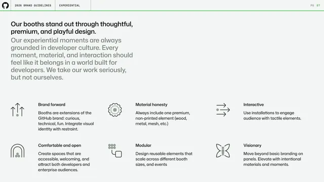
GitHub guidelines - experiential booth principles

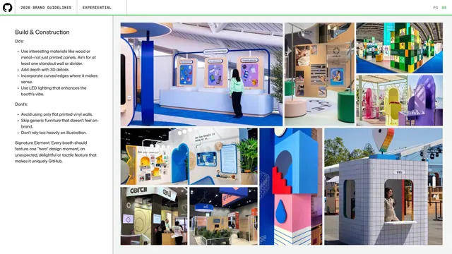
GitHub guidelines - booth build and construction

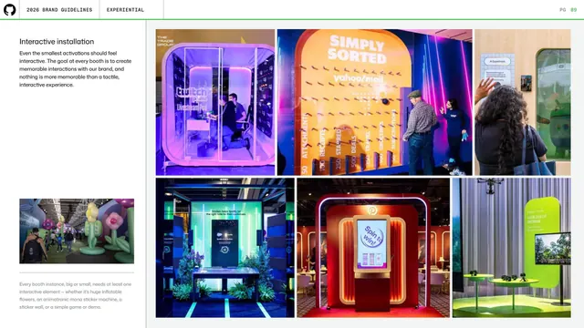
GitHub guidelines - interactive installations

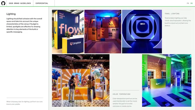
GitHub guidelines - experiential lighting

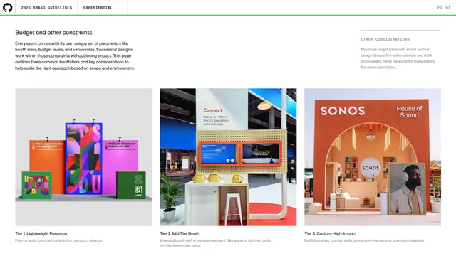
GitHub guidelines - booth budget tiers

GitHub guidelines - questions closing page