Preview image. Unlock full-res
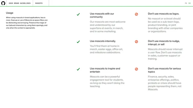
Mascot usage page contrasting three approved uses (green checks) with three prohibited uses (red no-entry icons) in two columns of short captioned rules.
Summary
A do-and-don't page for mascot usage: a left column of three green-checked approved uses faces a right column of three red-prohibited uses, each with a short heading and explanation.
Visual description
A small left intro ("Usage ... less is more") warns against overuse. The body is two aligned columns of three rows each. Left rows carry a green check and approved guidance (use mascots with the community, internally, to inspire and entertain). Right rows carry a red no-entry symbol and prohibitions (don't use as logos, to nudge/interrupt/sell, or for serious topics). Each item has a bold one-line heading over a muted paragraph. All on white with the standard header and green rule above.
Key takeaway
The clean parallel do/don't grid: matching numbers of items left and right, one icon system (green check vs red prohibition), short headline plus rationale, so rules are skimmable and balanced.
Reuse notes
A canonical usage-rules layout that transfers to any asset (logos, photography, voice). The symmetric two-column form reads faster than a single long list of mixed dos and don'ts.
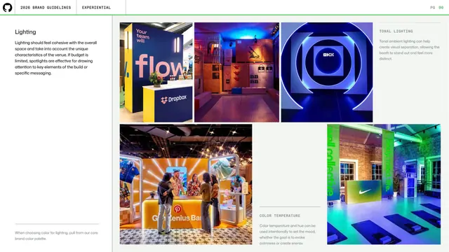
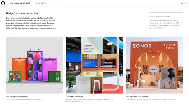
From this deck: GitHub guidelines - mascot usage do and don't
View deck






More like this



Keep what you find
A free account saves references to boards and can send you a weekly email of picks based on what you save.
To see every result, go Pro.