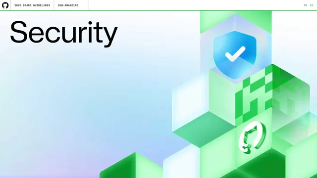
Preview image. Unlock full-res
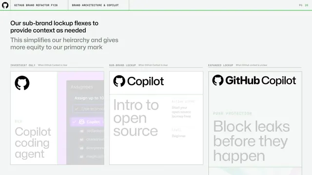
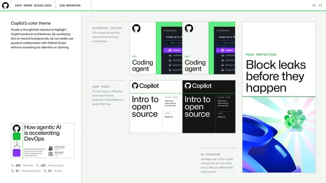
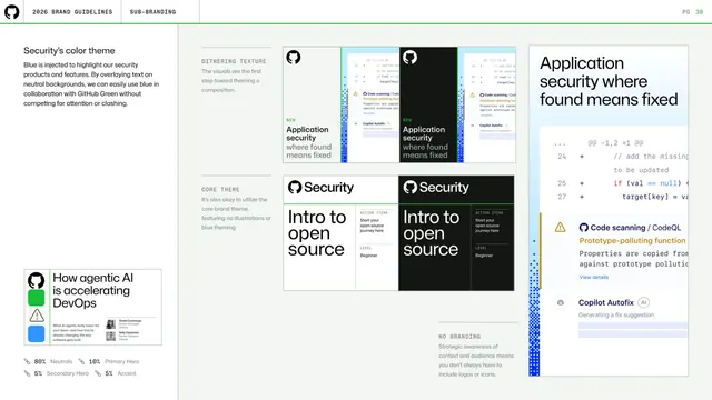
Light page showing Copilot's purple theme applied across dithering-texture, core-theme, push-protection, and no-branding example cards with an 80/10/5/5 ratio key.
Summary
A Copilot color-application page showing the purple theme realized across four treatment types, paired with the same 80/10/5/5 usage-ratio guidance.
Visual description
Light background. Left column: "Copilot's color theme" heading, grey copy, a "How agentic AI is accelerating DevOps" article thumbnail, and the green-marker ratio key (80% Neutrals, 10% Primary Hero, 5% Secondary Hero, 5% Accent). The right area is a labeled grid: DITHERING TEXTURE (light and dark Copilot coding-agent cards with green dither edges), CORE THEME (light and dark "Intro to open source" cards), PUSH PROTECTION ("Block leaks before they happen" with a prismatic gradient illustration), and NO BRANDING (a strategic-mascot note).
Key takeaway
Pairing the abstract color ratio with a concrete grid of real surfaces in light and dark. Showing both light and dark variants of each card proves the theme holds across modes.
Reuse notes
Close companion to the earlier Copilot color page; together they document the theme principle and its application. The light/dark card pairs are a tidy way to show theme robustness.
From this deck: Copilot color theme applications
View deck
More like this

Keep what you find
A free account saves references to boards and can send you a weekly email of picks based on what you save.
To see every result, go Pro.