Preview image. Unlock full-res
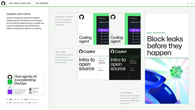
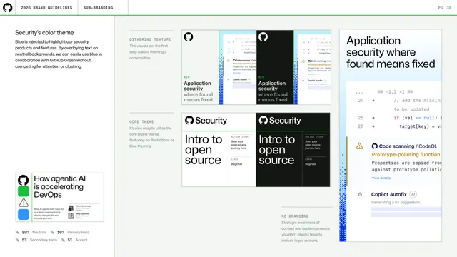
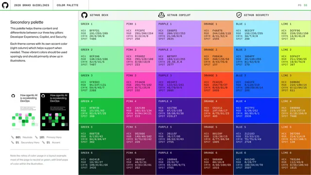
Light page on Copilot's purple color theme, showing dithering-texture, core-theme, push-protection, and no-branding treatments with an 80/10/5/5 color ratio note.
Summary
A page defining Copilot's purple color theme and how it pairs with GitHub Green, illustrated through dithering-texture, core-theme, push-protection, and no-branding example tiles, with an explicit color-usage ratio.
Visual description
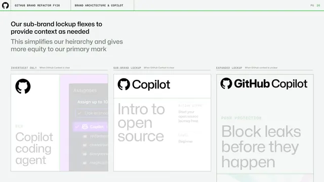
Light background. Left column: "Copilot's color theme" heading, grey copy about injecting purple to highlight Copilot while keeping it from competing with GitHub Green, a "How agentic AI is accelerating DevOps" thumbnail, and a green-marker ratio key (80% Neutrals, 10% Primary Hero, 5% Secondary Hero, 5% Accent). The right area is a labeled grid of example tiles under monospace headers: DITHERING TEXTURE (Copilot coding-agent cards with green accents), CORE THEME ("Intro to open source" cards), PUSH PROTECTION ("Block leaks before they happen" with a gradient illustration), and NO BRANDING (a blue 3D mouse-like form).
Key takeaway
The explicit 80/10/5/5 color ratio that keeps neutrals dominant and the brand hues as small heroes and accents. Showing one theme across several treatment types (dither, core, illustration, no-branding) demonstrates range while enforcing restraint.
Reuse notes
A model for documenting a sub-brand's accent color without letting it overpower the parent palette. The percentage ratio is a concrete rule worth copying into any color guideline.
From this deck: Copilot color theme and dithering
View deck
More like this


Keep what you find
A free account saves references to boards and can send you a weekly email of picks based on what you save.
To see every result, go Pro.