Preview image. Unlock full-res
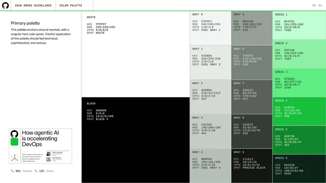
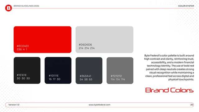
Primary palette spec page laying out white, black, ten grays and six greens as swatches with HEX, RGB, CMYK and SPOT values in monospace.
Summary
The full primary-palette specification: white, black, a ten-step gray ramp and a six-step green ramp, each swatch annotated with HEX, RGB, CMYK and SPOT values.
Visual description
A short left intro ("Primary palette ... anchors around neutrals, with a singular hero color green") sits above a small mocked content card and a "90% Neutral / 10% Green" ratio note. The right area is an asymmetric block layout: a large WHITE panel top-left and a large BLACK panel below it, a center two-column stack of GRAY 0 through GRAY 9, and a right column of GREEN 1 through GREEN 6 brightening then deepening. Every block carries left-aligned monospace HEX/RGB/CMYK/SPOT codes. Standard header and green rule above.
Key takeaway
The discipline of one annotation format on every swatch (HEX, RGB, CMYK, SPOT stacked in monospace) plus an explicit usage ratio (90/10) so the palette ships with both exact values and a proportion rule.
Reuse notes
A model production-ready palette spec for print and screen. The neutral ramp plus single hero-color ramp is a reusable structure for brands that want restraint with one accent.
From this deck: GitHub guidelines - primary palette specs
View deck
































More like this
Keep what you find
A free account saves references to boards and can send you a weekly email of picks based on what you save.
To see every result, go Pro.