Preview image. Unlock full-res
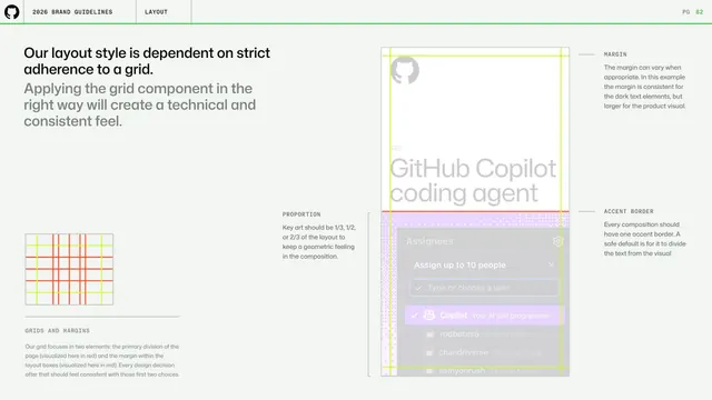
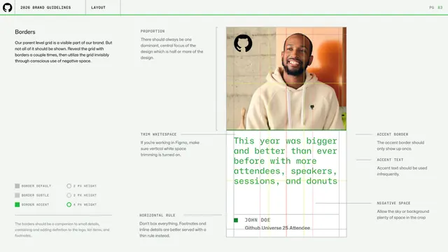
Layout page on using the grid and borders sparingly, annotating a photo-and-green-text event card with proportion, trim, accent border and negative-space notes.
Summary
A layout page on revealing the parent grid through borders only a couple of times then using it invisibly via negative space, annotated on a photo-plus-green-monospace event card.
Visual description
A left column ("Borders") explains the parent grid is part of the brand but shouldn't all be shown, with a lower swatch key for Border Default, Border Subtle and Border Accent at 2px and 4px weights. The right area is a tall card: a cropped photo of a smiling person in a cream hoodie up top, then a block of green monospace copy ("This year was bigger and better ...") and a "JOHN DOE / GitHub Universe 25 Attendee" footer, all overlaid with red and yellow grid guides. Edge annotations call out PROPORTION, TRIM WHITESPACE, HORIZONTAL RULE, ACCENT BORDER ("only show up once"), ACCENT TEXT ("used infrequently") and NEGATIVE SPACE. Standard header and green rule above.
Key takeaway
The principle of showing the grid through borders sparingly and otherwise expressing it through negative space, plus a weight key that pins exact border thicknesses to named roles.
Reuse notes
Good companion to the grids-and-margins page. The annotated photo card demonstrates restraint with borders and accent text, useful for editorial or event compositions.
From this deck: GitHub guidelines - borders and negative space
View deck