Preview image. Unlock full-res
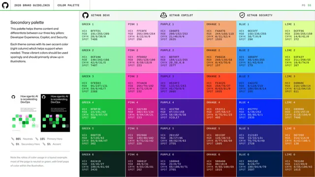
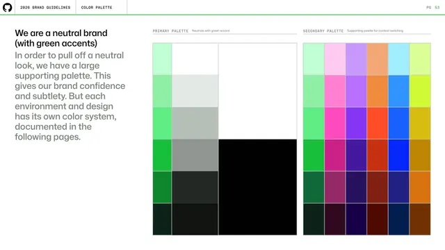
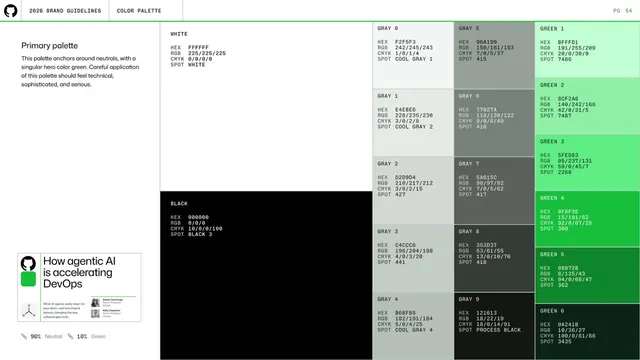
Secondary palette spec organizing vibrant green, pink, purple, orange, blue and lime ramps into three product-pillar columns (DevX, Copilot, Security) with full color codes.
Summary
The secondary palette laid out as six vibrant color ramps grouped under the three product pillars (GitHub DevX, GitHub Copilot, GitHub Security), each swatch annotated with HEX, RGB, CMYK and SPOT codes.
Visual description
A small left intro explains the palette differentiates the three pillars and assigns each an accent in the right column, to be used sparingly. The right area is a six-column matrix: GREEN, PINK, PURPLE, ORANGE, BLUE, LIME ramps running steps 1 to 6 from pale at top to deep at bottom. Column-group headers across the top carry small pillar marks (octocat, copilot, shield) labeling DevX, Copilot, Security. Each cell shows its name and stacked monospace color codes. Two small mocked content cards and an 80/10/5/5 usage-ratio key sit lower-left. Standard header and green rule above.
Key takeaway
Mapping a wide support palette onto named product pillars so color choice is tied to context, not taste, while keeping the same per-swatch code block as the primary page for consistency.
Reuse notes
Ideal for a multi-product brand that needs distinct accents per area without fragmenting into separate palettes. The pillar headers plus uniform ramps keep it organized and queryable.
From this deck: GitHub guidelines - secondary palette by pillar
View deck














More like this
Keep what you find
A free account saves references to boards and can send you a weekly email of picks based on what you save.
To see every result, go Pro.