Preview image. Unlock full-res
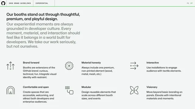
Experiential intro setting six booth design principles (brand forward, material honesty, interactive, comfortable, modular, visionary) as icon-led blurbs.
Summary
The experiential opener establishing that GitHub's booths stand out through thoughtful, premium, playful design, expressed as six icon-led principles.
Visual description
A large two-line headline ("Our booths stand out through thoughtful, premium, and playful design.") sits over a long gray paragraph about grounding experiential moments in developer culture. Below, a 3-by-2 grid of principles, each a monoline spot icon over a bold title and short paragraph: Brand forward, Material honesty, Interactive, Comfortable and open, Modular, Visionary. All on the off-white background with the standard header and green rule above.
Key takeaway
Opening an experiential or environmental section with a compact set of named principles, each anchored by a spot icon, so the philosophy is established before any build photos appear.
Reuse notes
A reusable principles layout for any section that governs physical or experiential design. The icon-plus-title-plus-blurb cell keeps six ideas scannable on one page.
From this deck: GitHub guidelines - experiential booth principles
View deck






More like this

Keep what you find
A free account saves references to boards and can send you a weekly email of picks based on what you save.
To see every result, go Pro.