Preview image. Unlock full-res
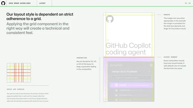
Layout page on strict grid adherence, annotating a product card with margin, proportion and accent-border callouts plus a small red grid diagram.
Summary
A layout page arguing the design system depends on strict grid adherence, using an annotated "GitHub Copilot coding agent" card to call out margin, proportion and accent-border decisions.
Visual description
A left headline ("Our layout style is dependent on strict adherence to a grid.") over a gray paragraph, with a small red-and-yellow grid diagram lower-left and a "GRIDS AND MARGINS" note explaining the primary page division (red) and the box margin (red). The right area shows a tall vertical card (octocat, "NEW / GitHub Copilot coding agent" headline, a purple-dither lower zone with the Assignees dropdown) overlaid with yellow margin guides and a red proportion line. Right-margin notes label MARGIN, PROPORTION ("Key art should be 1/3, 1/2, or 2/3 of the layout") and ACCENT BORDER ("Every composition should have one accent border"). Standard header and green rule above.
Key takeaway
Teaching grid discipline on a real composition with colored guide overlays and edge annotations, plus a concrete proportion rule (key art at 1/3, 1/2 or 2/3) that keeps layouts geometric.
Reuse notes
A clear way to document grid and margin logic without an abstract template. The overlay-plus-callout method works for any flagship layout you want to reverse-engineer for others.
From this deck: GitHub guidelines - grid and margins
View deck





















More like this


Keep what you find
A free account saves references to boards and can send you a weekly email of picks based on what you save.
To see every result, go Pro.