
Preview image. Unlock full-res
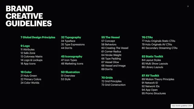
Dark contents page splitting the guide into four numbered sections in a green-ruled 2x2 quadrant grid with monospace page ranges.
Summary
The table of contents, dividing the guide into four big numbered sections set in a 2x2 quadrant separated by bright green dividing lines, each quadrant listing its sub-sections with monospace page ranges.
Visual description
Near-black background with a thin monospace header (logo, "2026 BRAND GUIDELINES", "INTRODUCTION", green page number). A bright green vertical and horizontal rule split the slide into four quadrants. Each carries a large green numeral (1 to 4) and a white Mona Sans title: Brand visual strategy, Visuals and illustration, Graphic devices, Events and experiential. Under each, two or three columns list sub-topics in monospace small caps above their page ranges (for example 1-14 BRAND ATTRIBUTES, 43-51 ILLUSTRATION, 74-85 TYPE and LAYOUT).
Key takeaway
Using a single green cross-rule to turn a contents page into four confident zones. Monospace page ranges set above all-caps labels read as precise and technical without extra ornament.
Reuse notes
A clean contents pattern for a long deck or report with a small number of major parts. The quadrant grid scales down to a two-column variant if you have more or fewer sections.
From this deck: Table of contents quadrant grid
View deck























































































More like this







Keep what you find
A free account saves references to boards and can send you a weekly email of picks based on what you save.
To see every result, go Pro.