Preview image. Unlock full-res
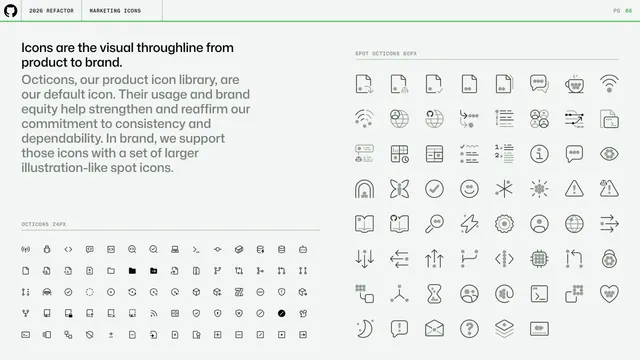
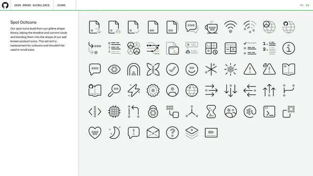
Icons intro contrasting the small 24px Octicons product library with larger illustration-like spot Octicons, shown as two big line-icon grids.
Summary
The icons opener framing icons as the throughline from product to brand, juxtaposing the compact 24px Octicons set with a larger 60px spot-Octicon set in two dense line-icon grids.
Visual description
A left column carries a black headline ("Icons are the visual throughline from product to brand.") over a gray paragraph, with an "OCTICONS 24PX" labeled grid of dozens of small monoline product icons beneath it. The right half is a "SPOT OCTICONS 60PX" grid of larger, slightly more illustrative monoline icons (files, chat, coffee, wifi, charts, faces, arrows, gears). All icons are thin dark strokes on the off-white page. Standard header and green rule above.
Key takeaway
Showing the relationship between two icon scales on one page (small utilitarian vs larger expressive) so the reader sees they share a visual language but serve different sizes.
Reuse notes
A good opener for any two-tier icon system. The side-by-side small-set and large-set grids make the size-and-role distinction obvious before the rules pages that follow.
From this deck: GitHub guidelines - icons as visual throughline
View deck






























More like this




Keep what you find
A free account saves references to boards and can send you a weekly email of picks based on what you save.
To see every result, go Pro.