OurFamilyWizard Brand Guidelines Book

An 86-slide co-parenting-platform brand book with a warm serif voice, alternating cream and pale-blue slides, a navy-and-sky palette, and a six-point spark symbol used as a running mark.

72 slides · Guideline

View deck overview
OurFamilyWizard brand book cover, editorial, minimal, dark
OurFamilyWizard brand book cover
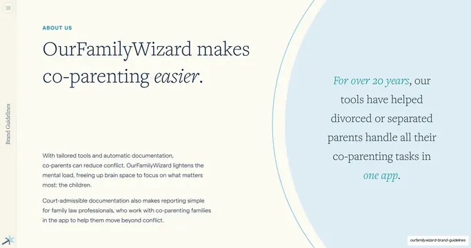
About us, makes co-parenting easier, editorial, minimal, light
About us, makes co-parenting easier
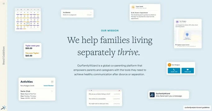
Our mission, families living separately thrive, editorial, minimal, light
Our mission, families living separately thrive
Our vision, harmony through life's challenges, editorial, minimal, light
Our vision, harmony through life's challenges
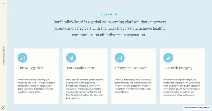
Our values, four-card grid, editorial, minimal, light
Our values, four-card grid
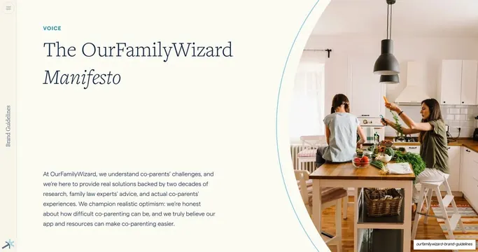
The OurFamilyWizard Manifesto, editorial, minimal, light
The OurFamilyWizard Manifesto
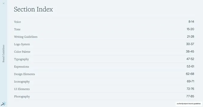
Section index, contents list, editorial, minimal, light
Section index, contents list
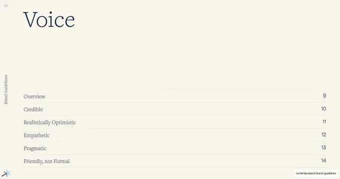
Voice section divider, editorial, minimal, light
Voice section divider
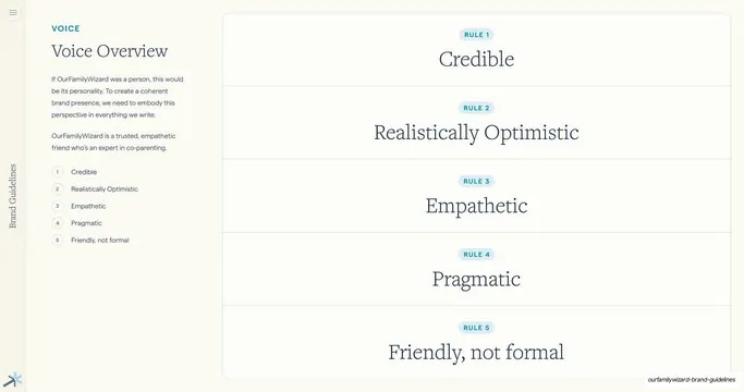
Voice overview, five rule cards, editorial, minimal, light
Voice overview, five rule cards
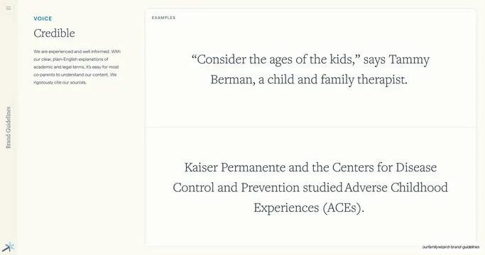
Voice, Credible with examples, editorial, minimal, light
Voice, Credible with examples
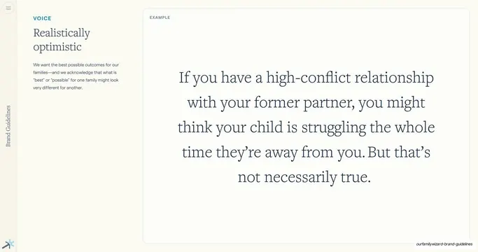
Voice, Realistically Optimistic, editorial, minimal, light
Voice, Realistically Optimistic
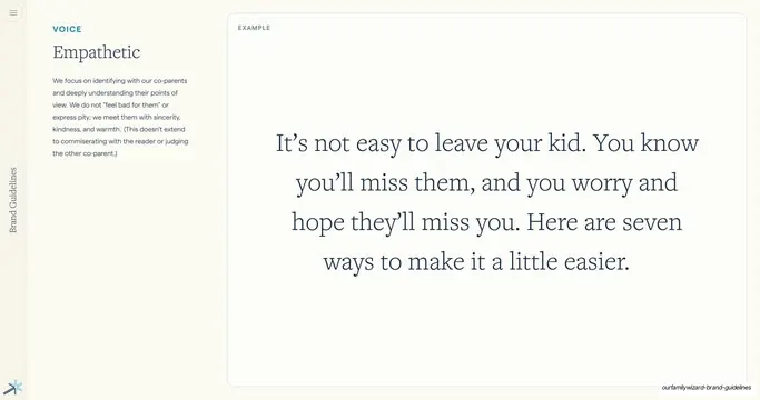
Voice, Empathetic, editorial, minimal, light
Voice, Empathetic
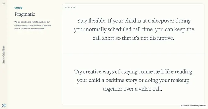
Voice, Pragmatic with examples, editorial, minimal, light
Voice, Pragmatic with examples
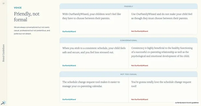
Voice, Friendly not formal comparison, editorial, minimal, light
Voice, Friendly not formal comparison
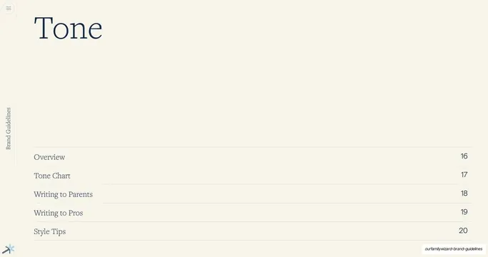
Tone section divider, editorial, minimal, light
Tone section divider
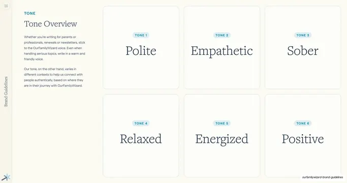
Tone overview, six tone cards, editorial, minimal, light
Tone overview, six tone cards
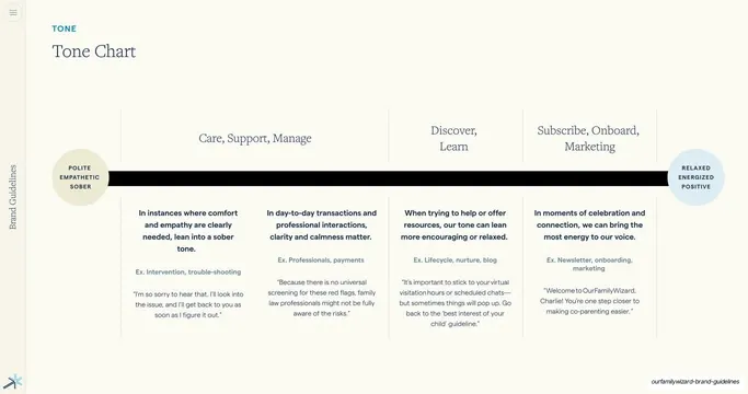
Tone chart, spectrum across contexts, editorial, minimal, light
Tone chart, spectrum across contexts
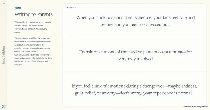
Tone, Writing to Parents with examples, editorial, minimal, light
Tone, Writing to Parents with examples
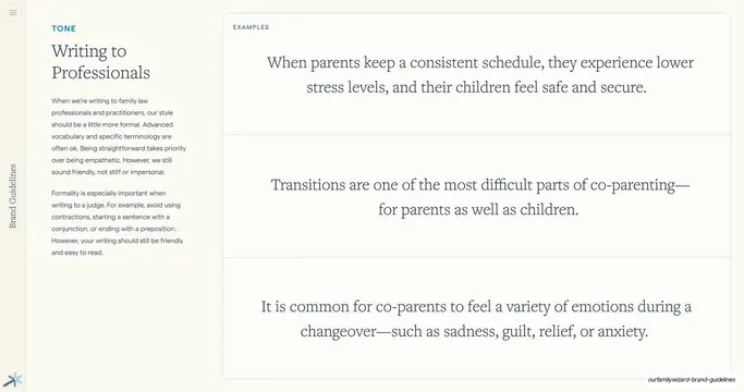
Writing to Professionals tone slide, editorial, minimal, light
Writing to Professionals tone slide
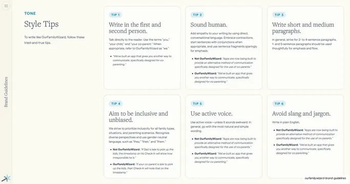
Style Tips six-card grid, editorial, minimal, light
Style Tips six-card grid
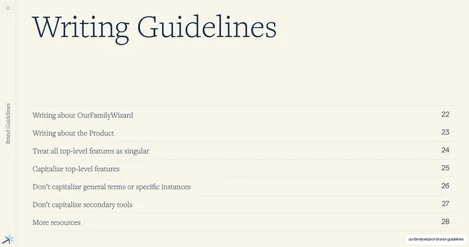
Writing Guidelines section contents, editorial, minimal, light
Writing Guidelines section contents
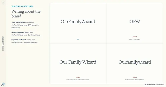
Writing about the brand do/don't quadrant, editorial, minimal, light
Writing about the brand do/don't quadrant
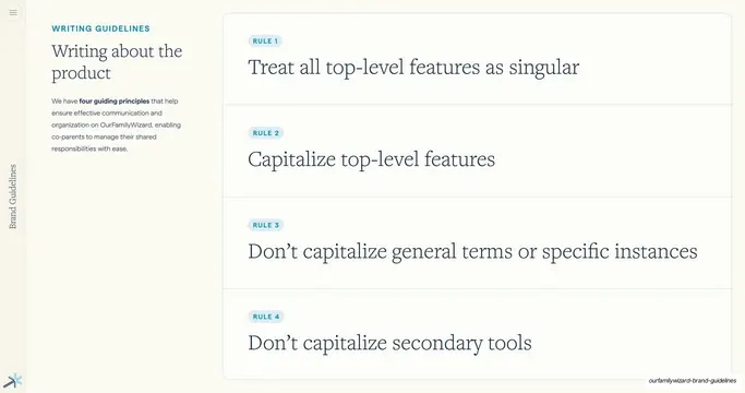
Writing about the product four rules, editorial, minimal, light
Writing about the product four rules
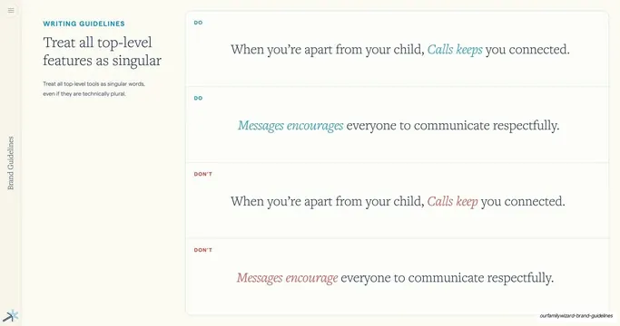
Treat features as singular do/don't examples, editorial, minimal, light
Treat features as singular do/don't examples
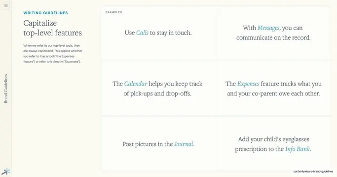
Capitalize features six-cell example grid, editorial, minimal, light
Capitalize features six-cell example grid
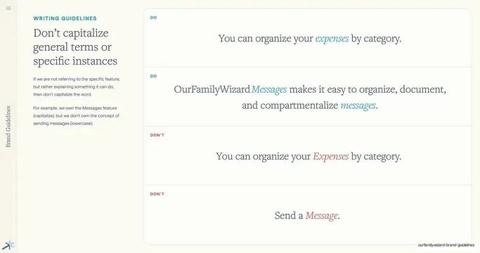
Don't capitalize general terms do/don't examples, editorial, minimal, light
Don't capitalize general terms do/don't examples
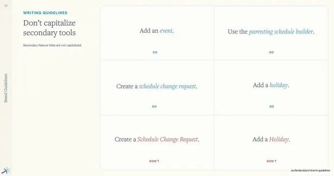
Don't capitalize secondary tools example grid, editorial, minimal, light
Don't capitalize secondary tools example grid
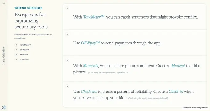
Exceptions for capitalizing secondary tools, editorial, minimal, light
Exceptions for capitalizing secondary tools
More resources link slide, editorial, minimal, light
More resources link slide
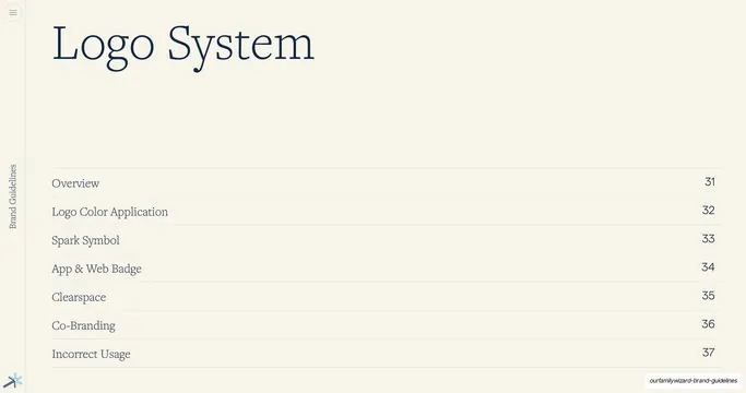
Logo System section contents, editorial, minimal, light
Logo System section contents
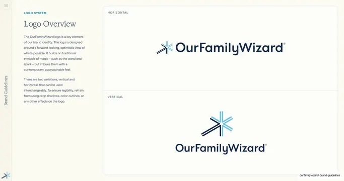
Logo Overview horizontal and vertical lockups, editorial, minimal, light
Logo Overview horizontal and vertical lockups
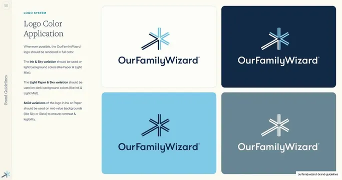
Logo Color Application four backgrounds, editorial, minimal, light
Logo Color Application four backgrounds
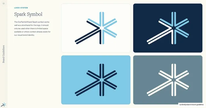
Spark Symbol on four backgrounds, editorial, minimal, light
Spark Symbol on four backgrounds
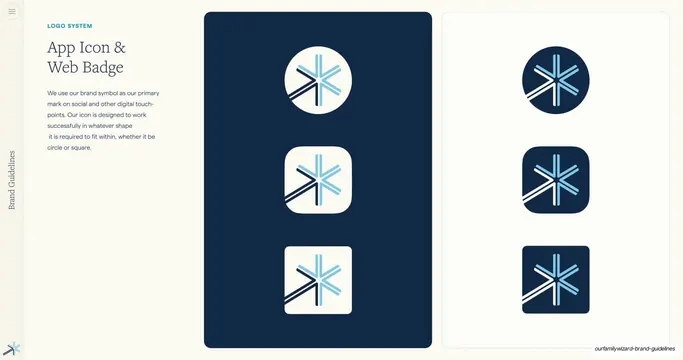
App Icon and Web Badge shapes, editorial, minimal, light
App Icon and Web Badge shapes
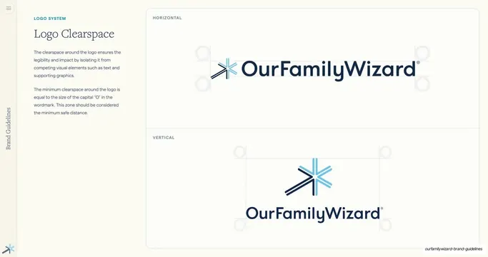
Logo Clearspace measurement diagram, editorial, minimal, light
Logo Clearspace measurement diagram
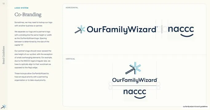
Co-Branding partner lockups, editorial, minimal, light
Co-Branding partner lockups
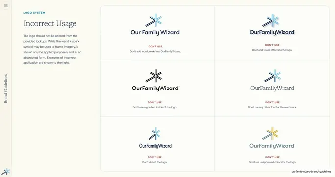
Logo incorrect usage grid, editorial, minimal, light
Logo incorrect usage grid
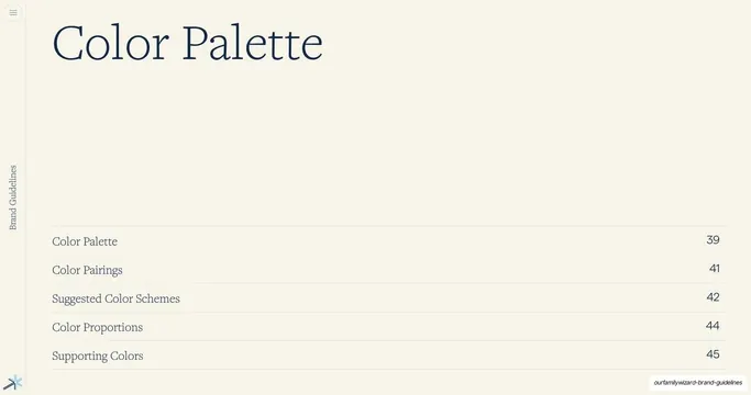
Color Palette section divider, editorial, minimal, light
Color Palette section divider
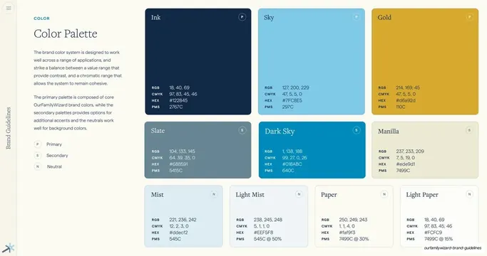
Color Palette swatch grid, editorial, minimal, light
Color Palette swatch grid
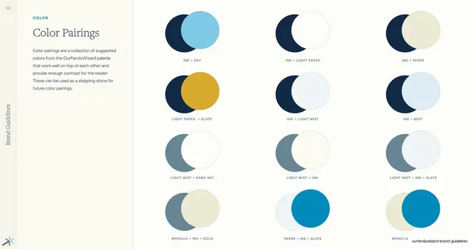
Color Pairings circle grid, editorial, minimal, light
Color Pairings circle grid
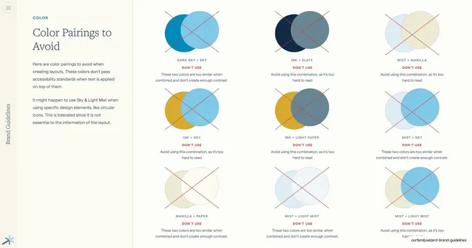
Color Pairings to Avoid grid, editorial, minimal, light
Color Pairings to Avoid grid
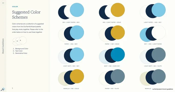
Suggested Color Schemes grid, editorial, minimal, light
Suggested Color Schemes grid
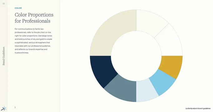
Color Proportions for Professionals donut, editorial, minimal, light
Color Proportions for Professionals donut
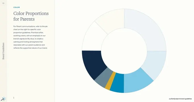
Color Proportions for Parents donut, editorial, minimal, light
Color Proportions for Parents donut
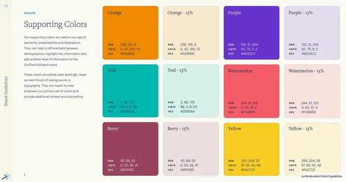
Supporting Colors swatch grid, editorial, minimal, light
Supporting Colors swatch grid
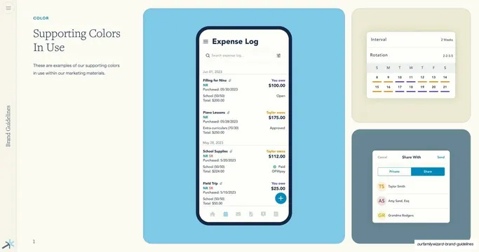
Supporting Colors In Use mockups, editorial, minimal, light
Supporting Colors In Use mockups
Typography section divider, editorial, minimal, light
Typography section divider
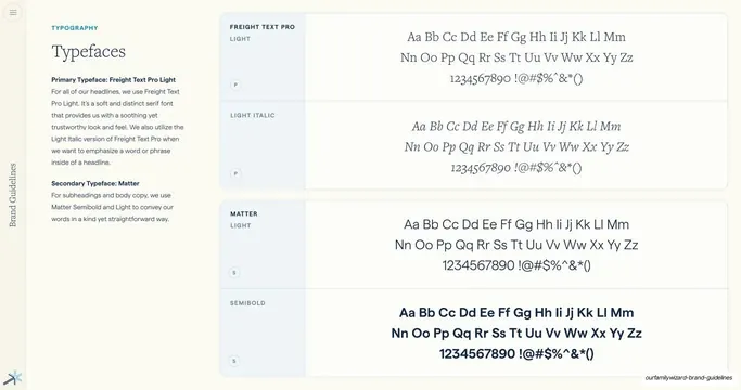
Typefaces specimen page, editorial, minimal, light
Typefaces specimen page
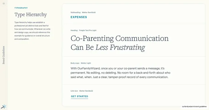
Type Hierarchy example, editorial, minimal, light
Type Hierarchy example
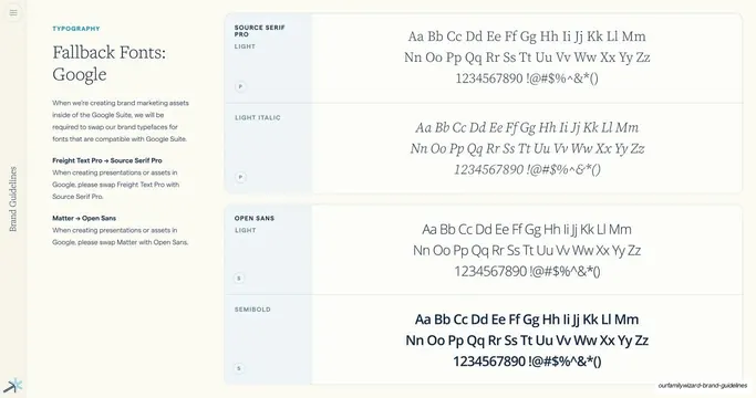
Fallback Fonts Google specimen, editorial, minimal, light
Fallback Fonts Google specimen
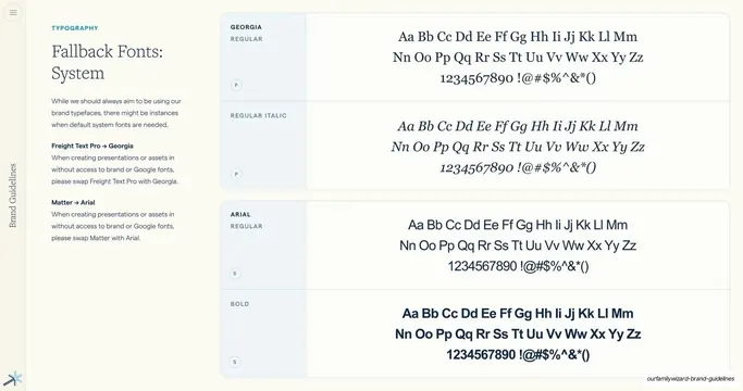
Fallback Fonts System specimen, editorial, minimal, light
Fallback Fonts System specimen
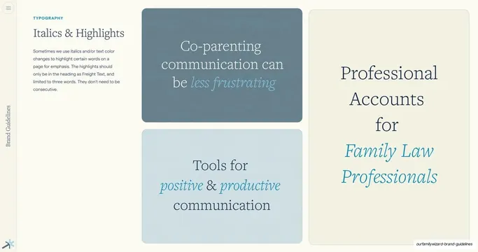
Italics & Highlights examples, editorial, minimal, light
Italics & Highlights examples
Expressions section divider, editorial, minimal, light
Expressions section divider
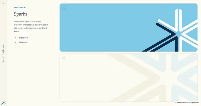
Sparks expression intro, editorial, minimal, light
Sparks expression intro
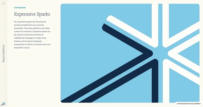
Expressive Sparks element intro, editorial, minimal, light
Expressive Sparks element intro
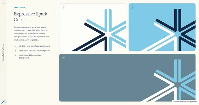
Expressive Spark color combinations, editorial, minimal, light
Expressive Spark color combinations
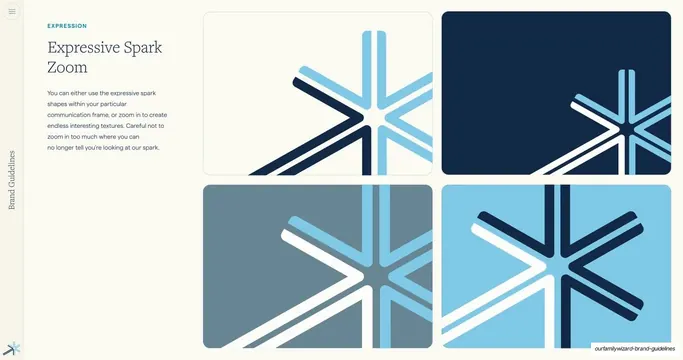
Expressive Spark zoom textures, editorial, minimal, light
Expressive Spark zoom textures
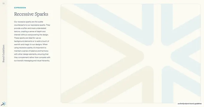
Recessive Sparks element intro, editorial, minimal, light
Recessive Sparks element intro
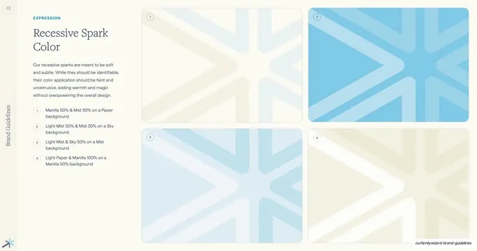
Recessive Spark color combinations, editorial, minimal, light
Recessive Spark color combinations
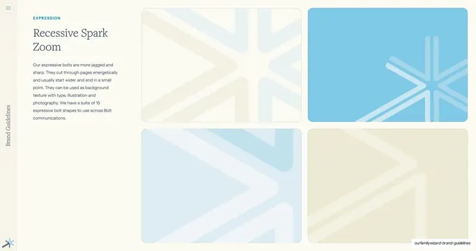
Recessive Spark zoom textures, editorial, minimal, light
Recessive Spark zoom textures
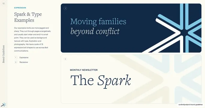
Spark and type application examples, editorial, minimal, light
Spark and type application examples
Design Elements section divider, editorial, minimal, light
Design Elements section divider
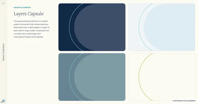
Layered Capsule design element, editorial, minimal, light
Layered Capsule design element
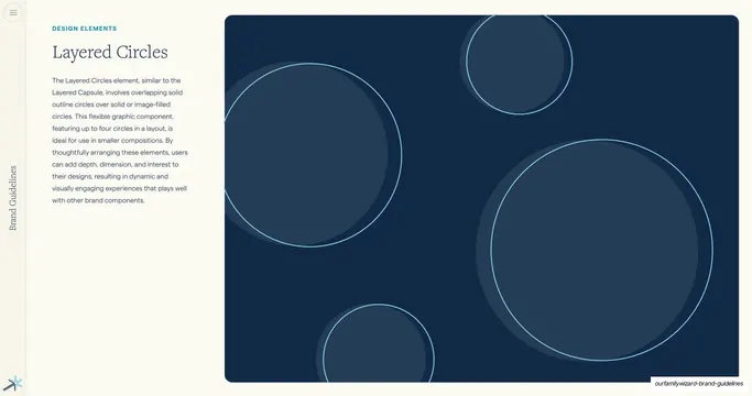
Layered Circles design element, editorial, minimal, dark
Layered Circles design element
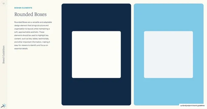
Rounded Boxes design element, editorial, minimal, light
Rounded Boxes design element
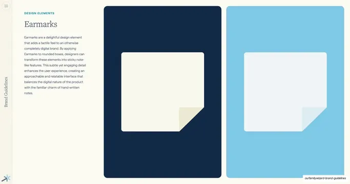
Earmarks design element, editorial, minimal, light
Earmarks design element
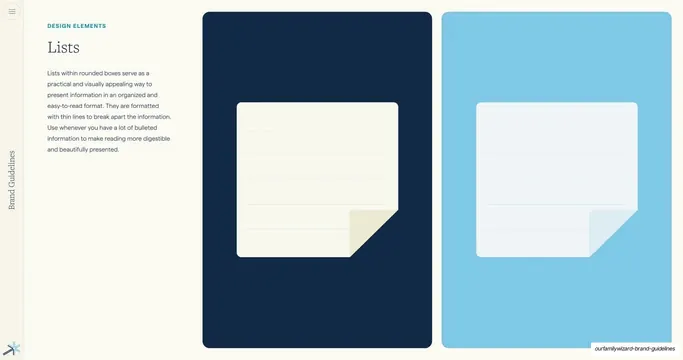
Lists design element, editorial, minimal, light
Lists design element
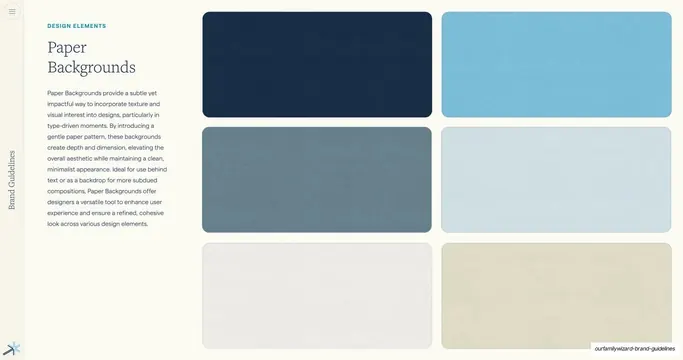
Paper Backgrounds design element, editorial, minimal, light
Paper Backgrounds design element
Iconography section divider, editorial, minimal, light
Iconography section divider
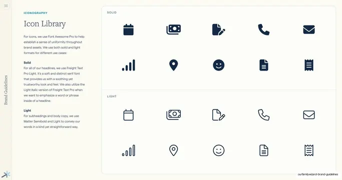
Icon Library overview, editorial, minimal, light
Icon Library overview
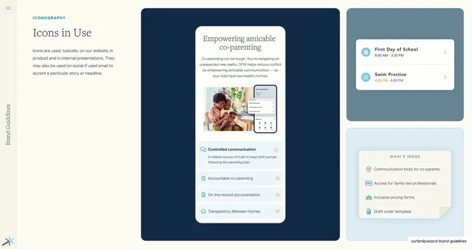
Icons in Use product examples, editorial, minimal, light
Icons in Use product examples
UI Elements section divider, editorial, minimal, light
UI Elements section divider