Preview image. Unlock full-res
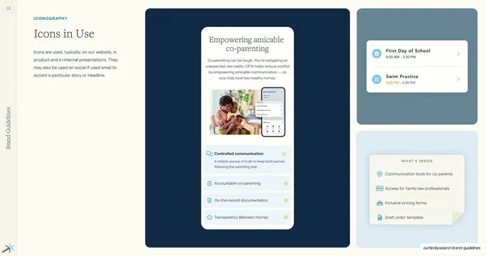
Iconography page showing icons applied in real product UI, a phone mockup and rounded feature cards with inline icons across navy and sky panels.
Summary
The Icons in Use page: icons shown applied in real product UI, a phone-style mockup plus rounded feature cards with inline icons, across navy and sky panels.
Visual description
Cream background. Left column carries the "ICONOGRAPHY" eyebrow, a serif headline "Icons in Use", and a short sans paragraph noting icons appear on the website, in product, in presentations, and small on social to accent a story. The right two-thirds is a composition of stacked panels. The large left navy panel holds a white card mocking up a product page titled "Empowering amicable co-parenting" with a serif headline, body copy, a photo of an adult and child with a phone, and an icon-led feature list ("Controlled communication", "Accountable co-parenting", and more) each with a small navy icon and plus/minus toggle. To the right, a slate panel holds a white card with two calendar-event rows ("First Day of School", "Swim Practice") each with a circular blue icon, and a pale-blue panel below holds a "WHAT'S INSIDE" card with four icon-led rows. The vertical "Brand Guidelines" label and corner spark glyph repeat.
Key takeaway
Closing an icon chapter with real applied UI instead of more abstract grids, showing icons at working size inside cards, lists, and event rows. It proves the icons earn their place in product, not just in the brand book.
Reuse notes
A strong "in context" page for any icon or component system. The mix of a hero product mockup with smaller supporting card examples is reusable. Needs realistic UI mockups and at least one photo to carry it.
From this deck: Icons in Use product examples
View deck


More like this

Keep what you find
A free account saves references to boards and can send you a weekly email of picks based on what you save.
To see every result, go Pro.