Preview image. Unlock full-res
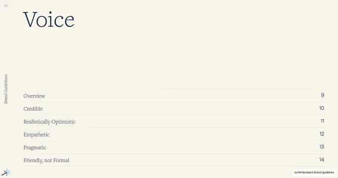
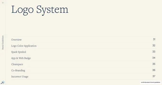
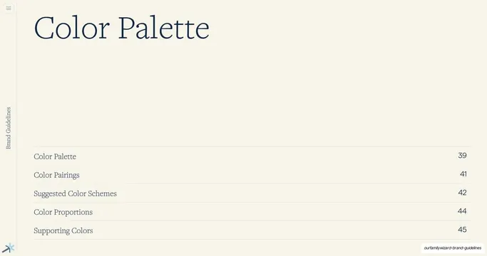
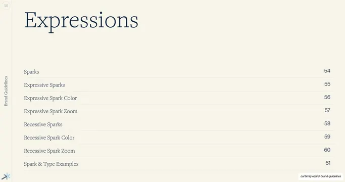
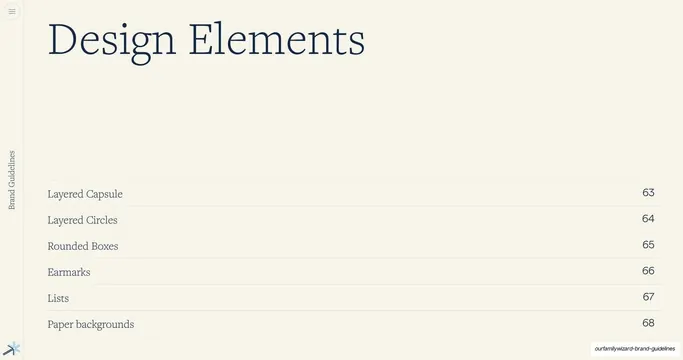
Section-divider slide for the Design Elements chapter, with a large serif title top-left and a hairline-ruled, page-numbered contents list below.
Summary
A chapter-opener divider for the "Design Elements" section, listing its sub-topics with page numbers on hairline rules.
Visual description
Full cream (#F7F3EC) background. A large navy serif display title "Design Elements" sits in the upper-left. The lower half is a mini table of contents: six rows, each a topic in navy serif on the left and a page number on the right, separated by thin full-width hairline rules: Layered Capsule 63, Layered Circles 64, Rounded Boxes 65, Earmarks 66, Lists 67, Paper backgrounds 68. The vertical "Brand Guidelines" label runs up the far-left margin and the small multi-color spark glyph sits in the bottom-left corner. No imagery; the page is pure typographic structure.
Key takeaway
Using a quiet, image-free divider that doubles as a localized table of contents, so each chapter announces exactly what it covers and where. The oversized serif title plus hairline-ruled page list is calm and premium.
Reuse notes
A repeatable section-opener pattern for long brand books and reports; the same layout recurs at the Iconography and UI Elements dividers in this deck. Pairs well with content pages that share the cream-and-navy palette.
From this deck: Design Elements section divider
View deck