Preview image. Unlock full-res
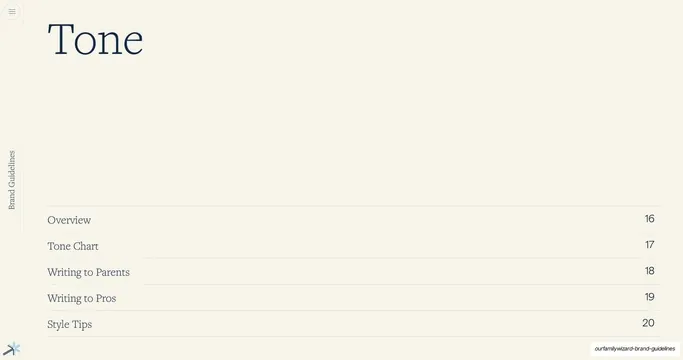
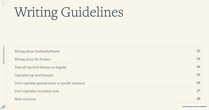
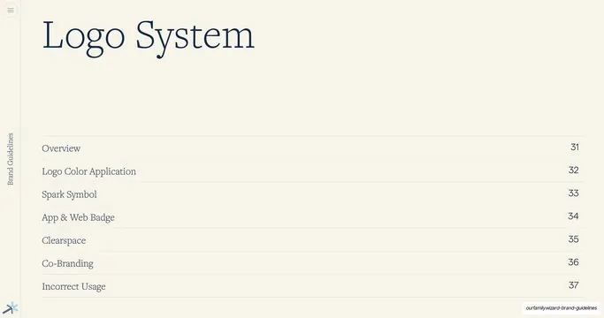
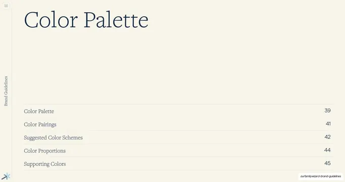
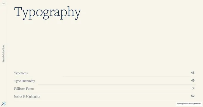
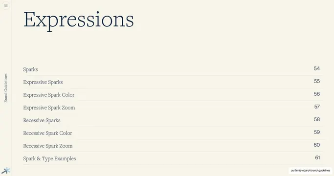
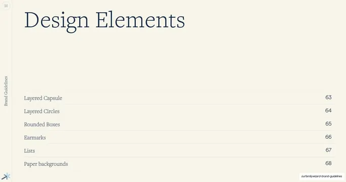
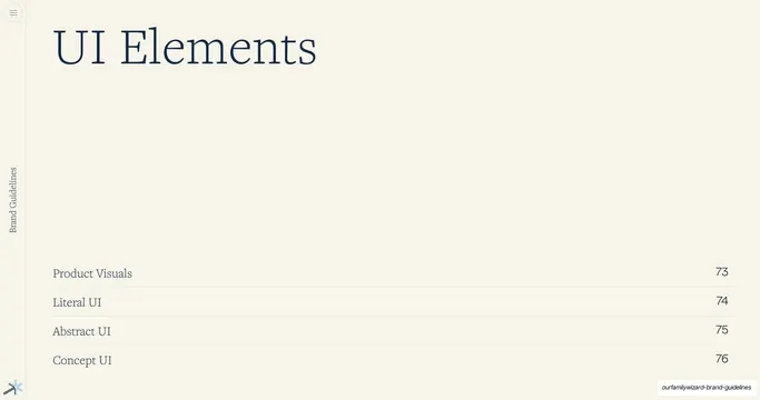
Section-divider slide for the UI Elements chapter, with a large serif title top-left and a hairline-ruled, page-numbered four-item contents list below.
Summary
A chapter-opener divider for the "UI Elements" section, listing its four sub-topics with page numbers on hairline rules.
Visual description
Full cream (#F7F3EC) background. A large navy serif display title "UI Elements" sits in the upper-left. The lower half is a mini table of contents: four rows, each a topic in navy serif on the left and a page number on the right, separated by thin full-width hairline rules: Product Visuals 73, Literal UI 74, Abstract UI 75, and Concept UI 76. The vertical "Brand Guidelines" label runs up the far-left margin and the small multi-color spark glyph sits in the bottom-left corner. No imagery; the page is purely typographic.
Key takeaway
The consistent chapter-divider template reused a third time, doubling as a localized table of contents. Repeating one calm divider layout across every section is what gives the long book its rhythm and navigability.
Reuse notes
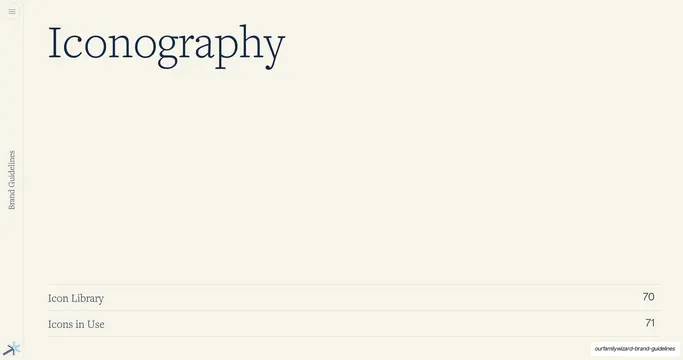
Identical structure to the Design Elements and Iconography dividers in this deck. A clean, reusable section opener for long brand books and reports.
From this deck: UI Elements section divider
View deck