Preview image. Unlock full-res
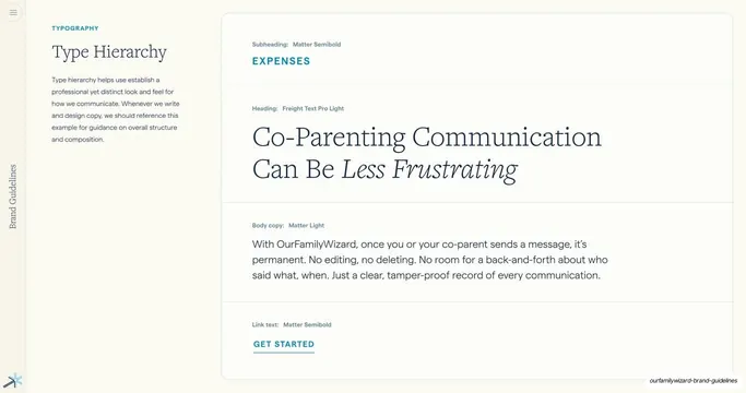
Type hierarchy page demonstrating subheading, heading, body and link styles in a single stacked example, each labeled with its typeface and weight.
Summary
A type-hierarchy page showing one continuous content block (subheading, heading, body copy, link) so the relative sizes and roles of each text style read at a glance.
Visual description
Two-column layout. Left: teal eyebrow "TYPOGRAPHY", serif heading "Type Hierarchy", and a short grey paragraph. Right: a single large card holding a stacked specimen. From top: a small teal all-caps subheading "EXPENSES" (labeled Matter Semibold); a big navy serif heading "Co-Parenting Communication Can Be Less Frustrating" with "Less Frustrating" set in italic (labeled Freight Text Pro Light); a paragraph of body copy (labeled Matter Light); and an underlined teal all-caps link "GET STARTED" (labeled Matter Semibold). Each tier carries a small grey role-and-font label. Hairline rules divide the tiers. "Brand Guidelines" label and spark mark on the left edge.
Key takeaway
Demonstrating hierarchy with a single realistic content example rather than disconnected size samples, and annotating each line with its exact typeface and weight, so the page is both a spec and a usage example. The italic emphasis inside the heading shows the brand voice in action.
Reuse notes
A practical type-scale page for any guideline. The "one real block, fully annotated" approach is more useful to implementers than an abstract scale. Reusable template: subheading, heading, body, link, each labeled.
From this deck: Type Hierarchy example
View deck





More like this


Keep what you find
A free account saves references to boards and can send you a weekly email of picks based on what you save.
To see every result, go Pro.