Preview image. Unlock full-res
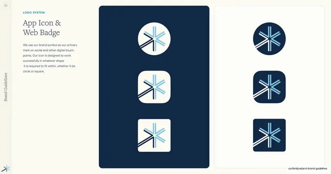
App-icon slide with copy at left and two tall panels showing the Spark mark inside circle, rounded-square, and squircle badges, light-on-navy and navy-on-light.
Summary
An app-icon and web-badge slide: copy on the left and two tall side-by-side panels showing the Spark symbol fitted into circle, rounded-square, and squircle badge shapes, one set light-on-navy, the other navy-on-light.
Visual description
Cream background. The left column has a teal "LOGO SYSTEM" eyebrow, a two-line navy serif heading ("App Icon & Web Badge"), and a gray sans paragraph noting the symbol is the primary mark on social and digital touchpoints and works in any shape. The right two-thirds holds two tall panels: the left panel is a deep-navy field with three stacked light badges (a circle, a squircle, and a rounded square), each holding the colored Spark; the right panel is a paper field with the inverse, three navy badges holding the Spark. The vertical "Brand Guidelines" label and small blue Spark symbol sit at the left edge and bottom-left.
Key takeaway
Showing the same mark across the three real platform shapes (circle, squircle, square) in both polarities answers "what does our app icon look like everywhere" in one slide. The paired navy and paper panels make the light and dark versions directly comparable.
Reuse notes
The go-to app-icon and favicon slide for any product brand. Reuse the multi-shape, dual-polarity layout; just match the badge shapes to the platforms you actually ship on (iOS squircle, Android circle, web square).
From this deck: App Icon and Web Badge shapes
View deck



More like this

Keep what you find
A free account saves references to boards and can send you a weekly email of picks based on what you save.
To see every result, go Pro.