Preview image. Unlock full-res
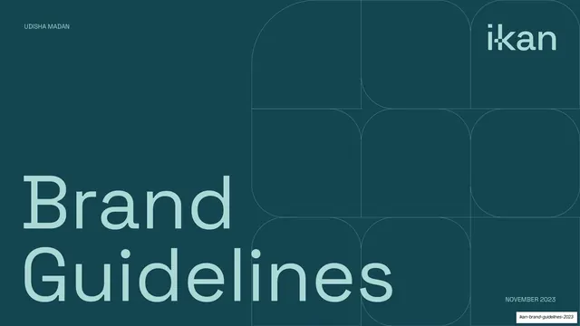
Dark teal section divider with an oversized two-line "Brand Strategy & Positioning" title and the recurring faint rounded-square lattice.
Summary
A chapter-opener divider: deep teal field with an oversized pale-mint "Brand Strategy & Positioning" anchored bottom-left and the faint rounded-square lattice in the upper area.
Visual description
Full-bleed midnight-green (#1A4A52) background matching the cover. "Brand Strategy & Positioning" is set large across two lines in pale mint grotesque, sitting in the lower portion. The same 3x3 lattice of large rounded-square hairline outlines fills the upper-right region. "IKAN TALENT MOBILITY" sits top-right and "NOVEMBER 2023" bottom-right; there is no left-side section number here.
Key takeaway
Reusing the exact cover treatment for every section divider builds rhythm across a long deck: the reader instantly recognizes a new chapter. The dark dividers also pace the otherwise light-background content.
Reuse notes
A repeatable section-divider system for any long guideline or report. The move worth copying is using the same dark/pattern slide as both the cover and every chapter break, so the deck reads as one system.
From this deck: IKAN brand strategy section divider
View deck