Preview image. Unlock full-res
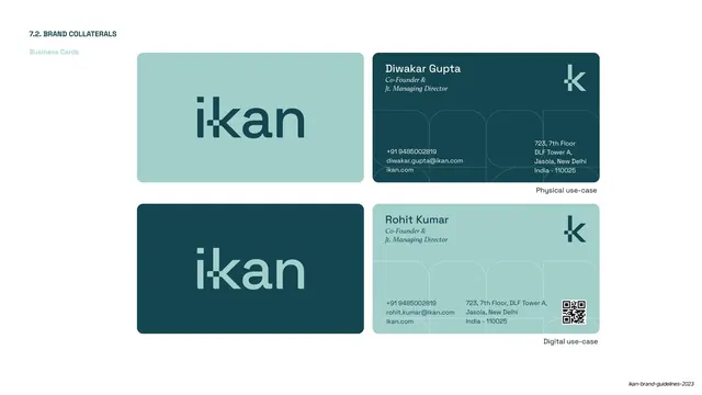
Front-and-back business card artwork in two colorways (physical mint/teal and digital teal/mint), the digital variant adding a QR code.
Summary
The business card spec: two rows showing front and back in flipped colorways, one labeled physical use-case and one digital with an added QR code.
Visual description
A white page labeled "7.2. BRAND COLLATERALS / Business Cards" top-left. The top row is the "Physical use-case": a mint front holding the large teal ikan logotype, and a dark teal back with the name "Diwakar Gupta", italic-serif title "Co-Founder & Jt. Managing Director", contact details, the "k" logomark, and the ghosted grid pattern. The bottom row is the "Digital use-case" in flipped colors: a dark teal front with mint logotype, and a mint back for "Rohit Kumar" with the same title and contact block plus a black QR code in the corner. Both backs reuse the rounded-square grid texture.
Key takeaway
Defining the card as a front/back pair in two inverted colorways and explicitly splitting physical vs. digital, with the QR code only on the digital version. The italic-serif job title against the sans name is a small, classy hierarchy move that recurs through the collateral.
Reuse notes
Part of the collaterals run (slides 48 to 53). Reusable template: show both faces, both colorways, and call out physical vs. digital use-cases on one page. The logomark and grid texture on the reverse keep even a text-heavy card on-brand.
From this deck: IKAN business card templates
View deck































More like this






Keep what you find
A free account saves references to boards and can send you a weekly email of picks based on what you save.
To see every result, go Pro.