Preview image. Unlock full-res
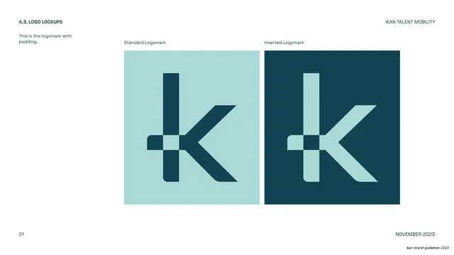
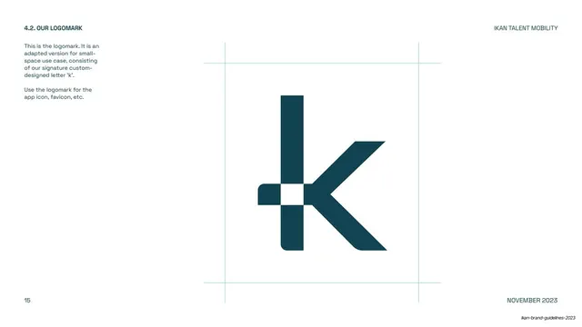
Logomark page showing the standalone "k" mark, with its plus-shaped negative space, in standard and inverted color tiles.
Summary
A page isolating the IKAN logomark, the lowercase "k" built from a bold vertical stroke crossed by a plus, shown standard on sky blue and inverted on midnight green.
Visual description
White page with the section utility frame ("4.3. LOGO LOCKUPS", "IKAN TALENT MOBILITY", page "21", "NOVEMBER 2023"). Two large near-square tiles sit centered-right, captioned "Standard Logomark" and "Inverted Logomark". The left tile is sky blue with a big dark "k" mark; the right tile is midnight green with the mark reversed to sky blue. The mark reads as a lowercase "k" whose vertical stem and angled leg meet a horizontal bar to form a small plus where they cross, the same plus motif used as the dot of the "i" in the wordmark. Generous padding surrounds the mark inside each tile.
Key takeaway
Cropping a single brandmark large and centered inside two solid tiles, with breathing-room padding, presents the mark as an icon in its own right and foreshadows favicon and app-icon use.
Reuse notes
A clean way to introduce a standalone logomark distinct from the wordmark. The plus-in-the-k construction is bespoke to IKAN; the layout pattern (mark, padding, two tiles, captions) transfers to any brand book documenting an icon mark.
From this deck: IKAN logomark with padding (standard and inverted)
View deck





























More like this





Keep what you find
A free account saves references to boards and can send you a weekly email of picks based on what you save.
To see every result, go Pro.