Preview image. Unlock full-res
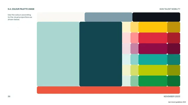
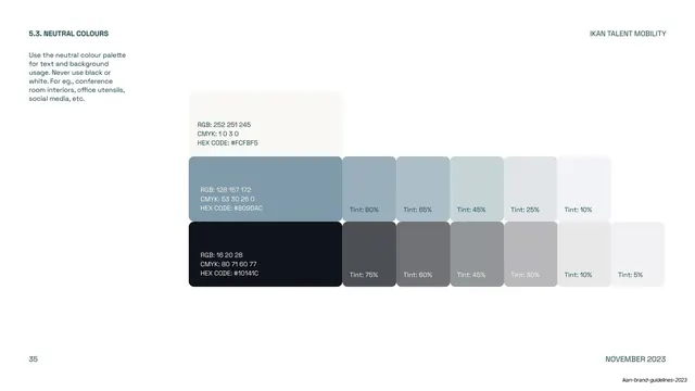
A proportion diagram showing how much of each brand colour to use, primaries dominant, neutrals and secondaries in smaller blocks, accent as a thin base bar.
Summary
A colour-proportion page: a composed block diagram where the size of each colour area encodes how much of the palette it should occupy, with sky blue and midnight green dominant, neutrals and secondaries as smaller cells, and the orange accent as a thin full-width base bar.
Visual description
White page, utility frame ("5.4. COLOUR PALETTE USAGE", "IKAN TALENT MOBILITY", page "36", "NOVEMBER 2023"); a short instruction "Use the colours according to the visual proportions as shown below" sits in the left margin. The body is a single mosaic of rounded rectangles: a wide off-white block and a blue-grey block plus a near-black block run across the top; beneath, two large blocks (pale sky blue, deep midnight green) dominate the left, while a column of small two-up secondary swatches (yellows, reds, magentas, teals, limes, greens with their tints) stacks on the right. A thin orange-red bar spans the full width at the very bottom.
Key takeaway
Turning palette ratios into a single proportional block composition, where area equals recommended usage, communicates "use lots of these, a little of that" instantly, far better than a percentage table.
Reuse notes
A smart closing page for a colour section: it resolves primary, secondary and neutral palettes into one usage picture. The accent-as-thin-bottom-bar signals "sparingly" without words. Reusable wherever a brand needs to govern color balance, not just list swatches.
From this deck: IKAN colour palette usage proportions
View deck












More like this

Keep what you find
A free account saves references to boards and can send you a weekly email of picks based on what you save.
To see every result, go Pro.