Preview image. Unlock full-res
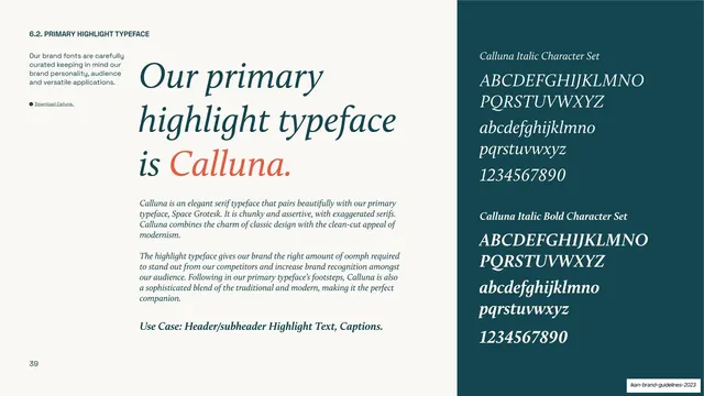
Type specimen page for the serif highlight face Calluna, with an italic cream headline left and a teal italic character-set panel right.
Summary
The highlight typeface page: the same specimen template as the primary face, now set in the italic serif Calluna to show its elegant, accent role.
Visual description
A cream page in the same two-zone layout as the Space Grotesk specimen. The left column carries "6.2. PRIMARY HIGHLIGHT TYPEFACE", an intro paragraph and a small download link. The oversized headline reads "Our primary highlight typeface is Calluna.", set in an italic serif with the name "Calluna." called out in coral. Two italic body paragraphs and a "Use Case: Header/subheader Highlight Text, Captions." line follow. The right dark teal panel shows "Calluna Italic Character Set" and "Calluna Italic Bold Character Set" in cream: uppercase, lowercase and numerals, all italic.
Key takeaway
Reusing the exact specimen template across a sans and a serif so the contrast between the two faces reads instantly at the system level. Setting the entire highlight page in italic serif demonstrates the face's intended use rather than just describing it.
Reuse notes
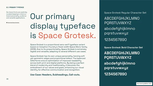
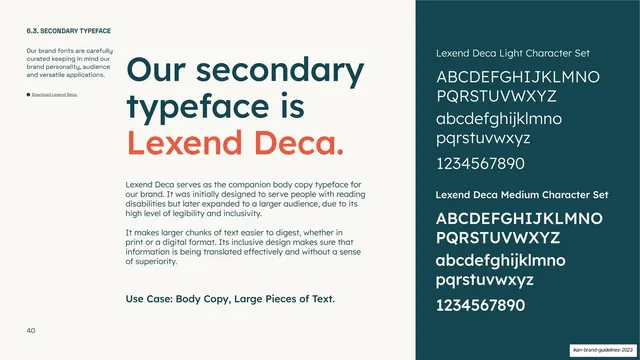
Pairs directly with the Space Grotesk page (slide 38) and the Lexend Deca page (slide 40); together they document the full type hierarchy in one consistent grid. The italic-serif-as-accent pattern is the move worth reusing for a brand that wants a touch of editorial warmth.
From this deck: IKAN highlight typeface (Calluna)
View deck
































More like this





Keep what you find
A free account saves references to boards and can send you a weekly email of picks based on what you save.
To see every result, go Pro.