Preview image. Unlock full-res
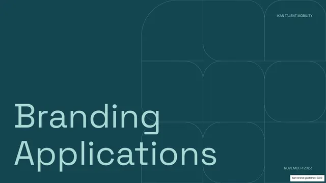
Full-bleed midnight-green section divider with a two-line mint "Branding Applications" headline over the faint rounded-square grid.
Summary
The applications section opener: a deep midnight-green field with a two-line mint "Branding Applications" headline filling the lower-left.
Visual description
A full-bleed dark teal (~#0E4D4D) slide, identical in grammar to the Typography divider. An oversized lowercase "Branding Applications" stacks across two lines in pale mint Space Grotesk along the bottom-left, bleeding off the edge. The same faint rounded-square-and-arc grid watermark sits upper-right in a lighter teal. Corner utility labels read "IKAN TALENT MOBILITY" top-right and "NOVEMBER 2023" bottom-right.
Key takeaway
Holding the divider template constant across sections (only the word changes) so each new chapter announces itself in the same calm, dark, oversized way. The two-line wrap shows the template flexes gracefully for longer section names.
Reuse notes
The matching pair to the Typography divider (slide 37). Reusable as the standard section break for the back half of the deck, where the brand's real-world applications begin. Dark-only; carry the same ghosted pattern throughout for cohesion.
From this deck: IKAN branding applications divider
View deck