Preview image. Unlock full-res
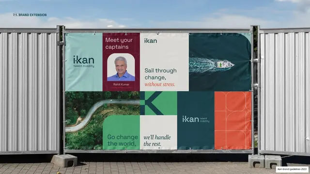
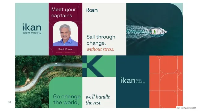
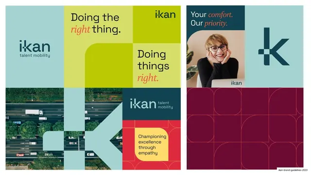
Two square campaign compositions built from the modular tile grid, pairing value-led headlines with aerial road photography and a smiling portrait.
Summary
Two more square campaign layouts from the same tile kit, this time built around value statements: "Doing the right thing." and "Your comfort. Our priority."
Visual description
A white page holding two square compositions side by side. The left square is a four-by-four-ish tile grid in mint, lime-green (~#C6D92E), teal and a red cell: headlines "Doing the right thing." and "Doing things right." mix sans with coral italic serif; an aerial highway photo, the ikan lockup on teal, a red/yellow "Championing excellence through empathy" cell, and the large mint "k" logomark cut into the grid. The right square pairs a teal "Your comfort. Our priority." headline block (with coral italic accents) and a smiling woman-at-laptop photo over a deep magenta panel carrying the ghosted rounded-square pattern and a large teal "k".
Key takeaway
Scaling the same modular kit down to square social/print formats, and widening the color range (lime, red, magenta) while keeping the teal/mint/coral core. The value statements as oversized split headlines give each composition a clear message anchor.
Reuse notes
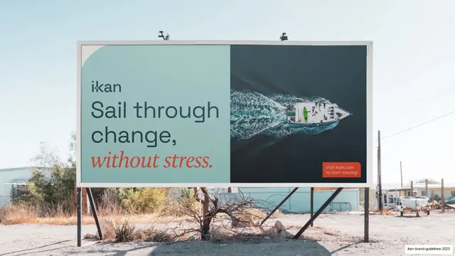
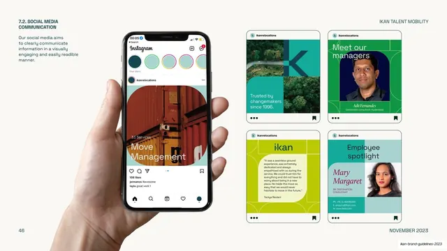
Continues the applications run (slides 42 to 45) at square aspect, useful as the social/print counterpart to the wide banner. The lime and red tiles show how far the secondary palette can stretch before the system loses cohesion. Needs warm lifestyle photography to balance the flat color blocks.
From this deck: IKAN value-led campaign tiles
View deck