Preview image. Unlock full-res
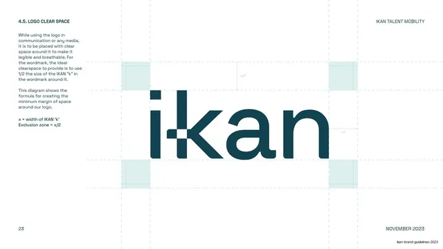
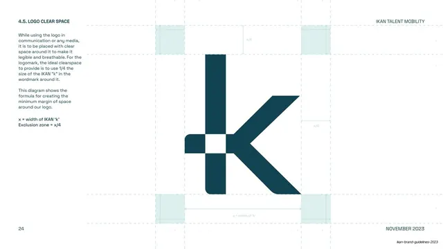
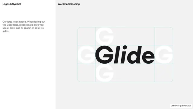
Clear-space diagram for the wordmark, with the giant "ikan" overlaid by a dashed exclusion-zone grid set to half the width of the "k".
Summary
A clear-space specification page: the wordmark "ikan" blown up huge and wrapped in a dashed measurement grid defining the minimum margin as x/2, where x is the width of the "k".
Visual description
White page with the utility frame ("4.5. LOGO CLEAR SPACE", "IKAN TALENT MOBILITY", page "23", "NOVEMBER 2023"). A two-paragraph instruction plus the formula "x = width of IKAN 'k' / Exclusion zone = x/2" sits in the left margin in dark grotesk. The right two-thirds is filled by an oversized midnight-green "ikan" wordmark. Pale dashed guidelines extend from each letter edge outward, with faint sky-blue square corner blocks marking the exclusion zone and small "x/2" callouts labeling the gaps. The plus-dot over the "i" is clearly visible at this scale.
Key takeaway
Using the brand's own letterform (the "k") as the measuring unit for clear space, then rendering the rule at poster scale with light dashed guides, makes an abstract spacing spec feel concrete and on-brand.
Reuse notes
The canonical clear-space page pattern for a brand book. Pairing oversized artwork with thin dashed exclusion guides and a letter-derived unit is directly reusable. Reads as a set with slide-24 (logomark clear space) and slides 25-26 (lockup clear space).
From this deck: IKAN wordmark clear space (x/2)
View deck












































More like this







Keep what you find
A free account saves references to boards and can send you a weekly email of picks based on what you save.
To see every result, go Pro.