Preview image. Unlock full-res
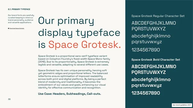
Type specimen page for Space Grotesk, with a big cream headline left and a teal character-set panel on the right.
Summary
The primary display typeface page: a large statement headline naming Space Grotesk, paired with a dark right-hand panel showing its full character sets.
Visual description
A cream (#F7F3EC) page split into two zones. A narrow left column holds the section number "6.1. PRIMARY TYPEFACE", a short intro paragraph and a small bulleted download link. The wide middle carries an oversized teal headline, "Our primary display typeface is Space Grotesk." with the typeface name itself called out in coral (~#FF6B4A). Two body paragraphs and a bold "Use Case: Headers, Subheadings, Call-outs." line sit below. A full-height dark teal panel on the right displays "Space Grotesk Regular Character Set" and "Space Grotesk Bold Character Set" in cream: uppercase, lowercase, and numerals for each weight.
Key takeaway
The "name the font in the headline, and color the font name in the accent" move, so the specimen headline doubles as a live sample. The dark character-set panel on the right is a clean, reusable slot for showing the full alphabet at a glance against the lighter page.
Reuse notes
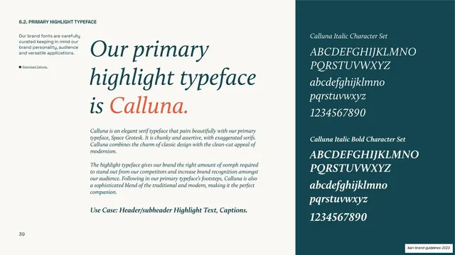
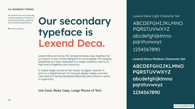
A strong, repeatable type-specimen template for brand guidelines: identical layout works for every typeface in the system (see the Calluna and Lexend Deca pages that follow). Keep the accent reserved for the font name so the trick stays legible.
From this deck: IKAN primary typeface (Space Grotesk)
View deck































More like this







Keep what you find
A free account saves references to boards and can send you a weekly email of picks based on what you save.
To see every result, go Pro.