
Preview image. Unlock full-res
Introduces the brand pattern, a full-bleed grid of large squares with quarter-round corners derived from the logomark's geometry.
Summary
The brand-pattern page: a large-scale, full-bleed grid of cells whose corners round off into quarter-circles in varying directions, drawn as thin outlines, presented as a flexible decorative system derived from the logo.
Visual description
Off-white (#FCFBF5) page; a short utility label "4.8. LOGO/BRAND PATTERN" and instruction sit in the upper-left margin with a "Download brand pattern" link, "IKAN TALENT MOBILITY" upper-right, page "30" and "NOVEMBER 2023" at the foot. The rest of the slide is overtaken by an oversized modular grid: square cells outlined in thin midnight-green strokes, each with one or more corners swept into a quarter-circle, the radii alternating cell to cell so the squares read as a field of soft, rounded super-ellipse shapes. The pattern bleeds off all edges.
Key takeaway
Generating a brand pattern by taking one geometric move from the logo (here the soft rounded corner) and tiling it at architectural scale gives endless flexible artwork that still feels on-brand without repeating the logo itself.
Reuse notes
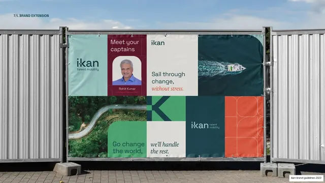
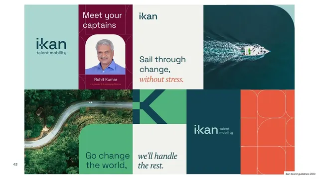
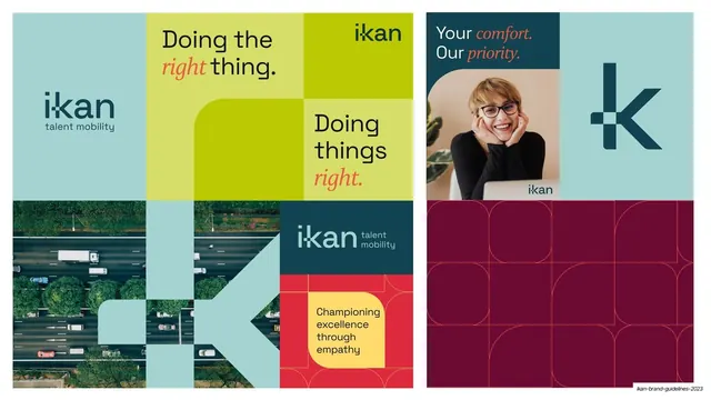
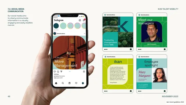
A reusable approach for deriving a secondary graphic language from a mark's geometry. Outlined at large scale it works as a backdrop; the same cells appear filled and colored on later application pages (section dividers, social, OOH). Keep stroke weights light so it stays a texture, not a focal point.
From this deck: IKAN brand pattern (rounded-corner grid)
View deck



































More like this








Keep what you find
A free account saves references to boards and can send you a weekly email of picks based on what you save.
To see every result, go Pro.