Preview image. Unlock full-res
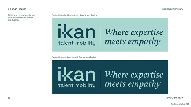
Logo-lockups page adding the serif tagline "Where expertise meets empathy" beside the vertical lockup, shown standard and inverted.
Summary
The full vertical lockup including the italic serif tagline "Where expertise meets empathy", documented in a standard sky-blue treatment stacked above an inverted midnight-green treatment.
Visual description
White page, same utility frame as the rest of the logo section ("4.3. LOGO LOCKUPS" upper-left, "IKAN TALENT MOBILITY" upper-right, page "20" and "NOVEMBER 2023" at the foot). Two stacked landscape tiles fill the right two-thirds. The top tile is sky blue: the vertical "ikan / talent mobility" lockup sits left, a thin vertical divider rule separates it from the tagline "Where expertise / meets empathy" set in a dark italic serif. The bottom tile repeats the arrangement inverted on midnight green with the tagline in pale serif. Tiles are captioned "Vertical Standard Lockup with Descriptor & Tagline" and "Vertical Inverted Lockup with Descriptor & Tagline".
Key takeaway
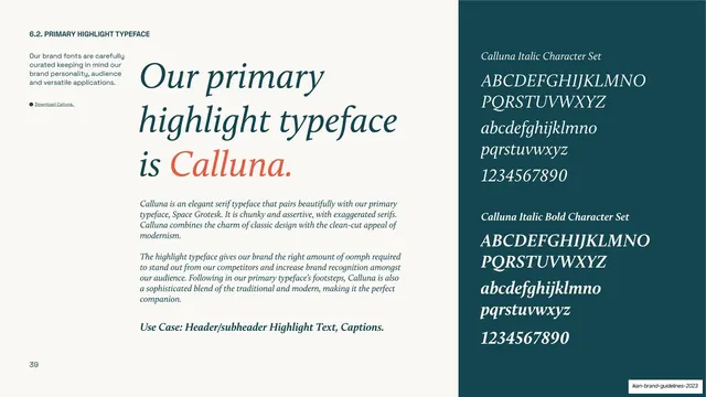
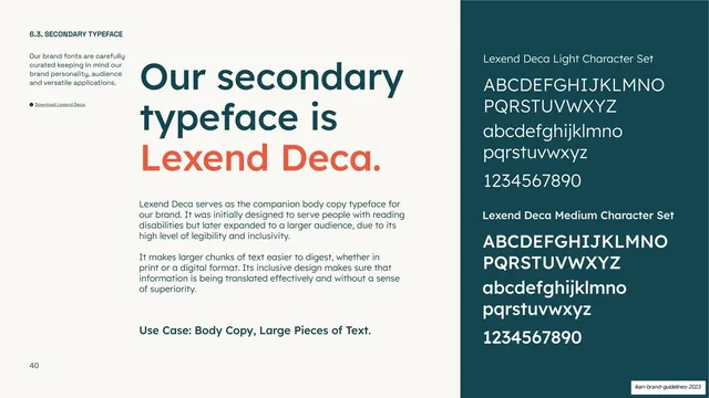
Pairing a geometric sans wordmark with an italic serif tagline across a hairline divider is the brand's core type contrast, and showing it locked up at full size makes the sans/serif relationship the takeaway of the page.
Reuse notes
Good reference for brands that mix a grotesk mark with a serif voice line. The thin vertical rule between mark and tagline is a tidy, reusable separator. Best read alongside slide-19 (lockup without tagline) and the grayscale page.
From this deck: IKAN vertical lockup with descriptor and tagline
View deck

























More like this





Keep what you find
A free account saves references to boards and can send you a weekly email of picks based on what you save.
To see every result, go Pro.