Preview image. Unlock full-res
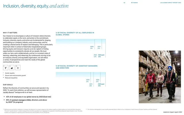
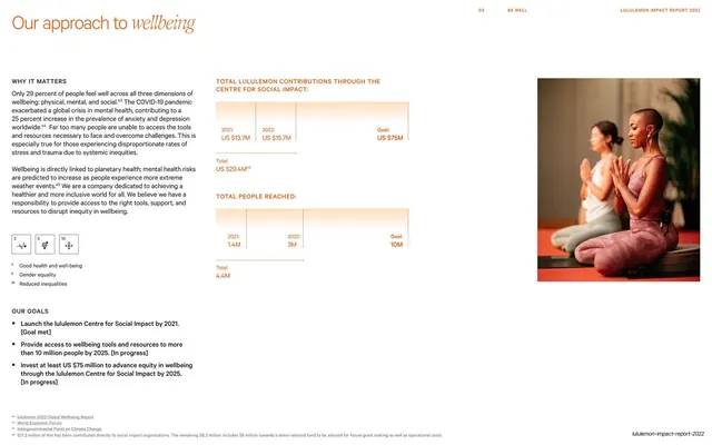
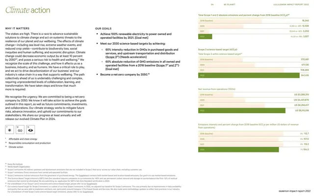
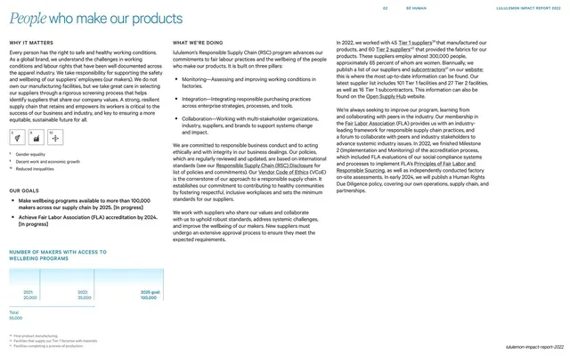
Light detail page with a mixed sans/serif-italic headline, a Why It Matters / Our Goals column, SDG icons, three-pillar body copy, and a faint bar chart of makers reached.
Summary
The People Who Make Our Products topic page: the standard report grammar again, a mixed sans/serif-italic headline over a Why It Matters / Our Goals column with SDG icons, three-pillar body copy, and a faint bar chart of makers reached at lower left.
Visual description
A white page headlined "People who make our products", with "People" in a serif italic. The left column runs "Why It Matters", a row of three numbered SDG icon tiles, and an "Our Goals" list with two bold bullets. The center column carries "What We're Doing" with three bold bullet pillars (Monitoring, Integration, Collaboration). At lower left, a "Number of Makers with Access to Wellbeing Programs" title sits over a pale bar chart stepping from a 2021 value to a 2025 goal. The thin "02 BE HUMAN / LULULEMON IMPACT REPORT 2022" header and bottom footnotes frame the page.
Key takeaway
The unwavering reuse of one topic-page template, headline lockup, left context-and-goals rail, SDG icons, bulleted pillars, and a single understated chart. Across many topics this consistency is the whole design system; nothing competes for attention page to page.
Reuse notes
Use as the standard content page for each report section, swapping only the headline word set in italic, the goals, and the chart. The three-pillar bullet pattern is handy for summarizing a program's structure. Keep the chart faint and the footnotes small so the page stays calm and legible.
From this deck: People who make our products detail page
View deck