Preview image. Unlock full-res
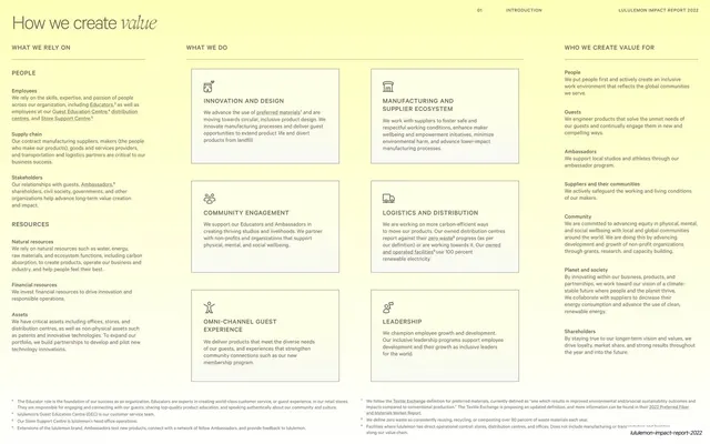
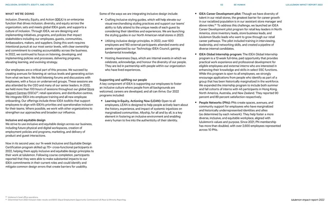
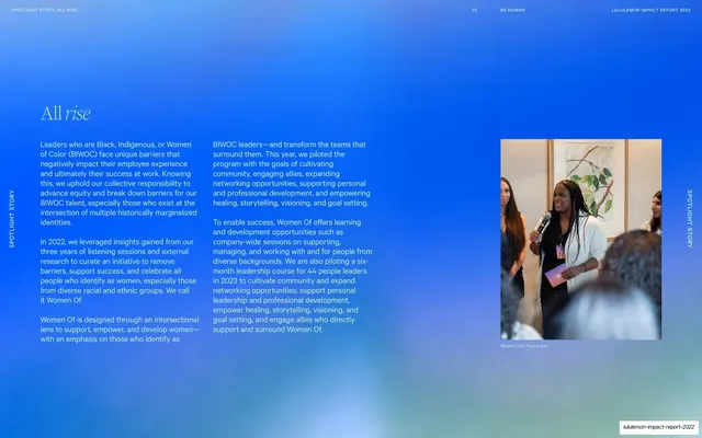
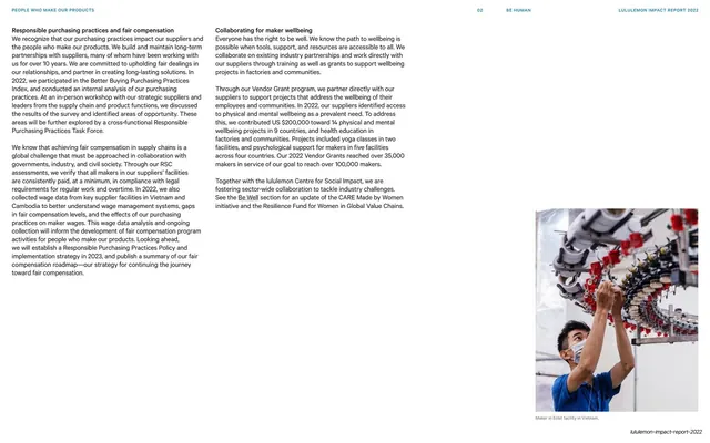
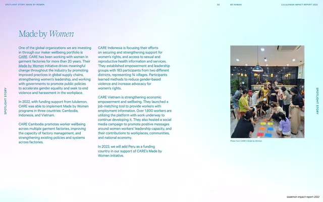
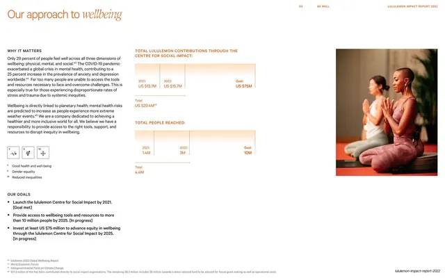
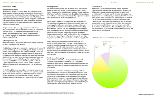
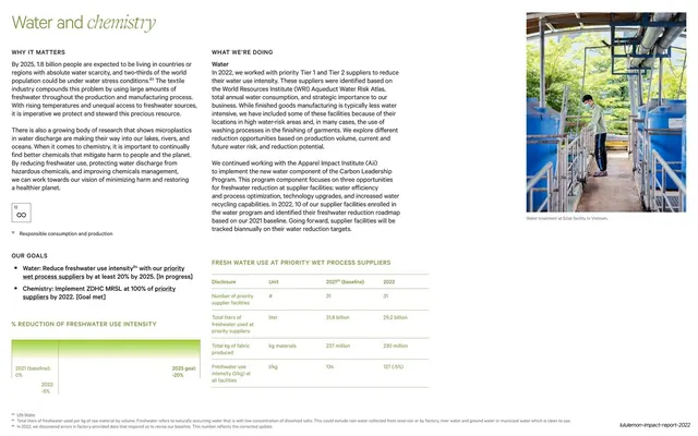
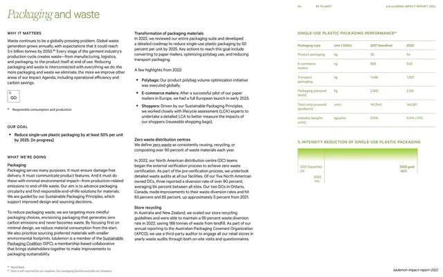
Multi-column explanatory text under an italic-serif title, with a soft lime gradient block floating top-right and a bulleted focus-areas list.
Summary
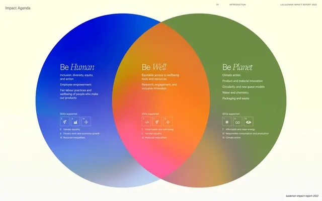
An "Impact Agenda" explainer page: an italic-serif title with a soft lime gradient block floating in the top-right, over three columns of body copy that end in a bulleted list of focus areas.
Visual description
Cream page. "Impact Agenda" runs large across the top with "Agenda" in italic serif. A single soft, glowing lime-green-to-pink gradient rectangle floats in the upper-right corner as the only image. The lower two-thirds is filled with small body copy arranged in roughly three columns explaining how the agenda works; the right column resolves into a short bulleted list of activation points. A footnote anchors the bottom. Wide margins and column gutters keep the dense text calm.
Key takeaway
Using one small floating gradient block as the page's only visual, set against an otherwise all-text explainer, so the brand gradient appears even on a copy-heavy page without a photo. The bulleted list at the end of the prose gives the reader a crisp takeaway.
Reuse notes
Good for a methodology or framework-explainer page that is mostly narrative but still needs a brand cue. The floating gradient swatch is a low-effort way to keep visual identity on text pages. Multi-column body copy demands disciplined line lengths; convert the key points to bullets as done here so the page is not a solid wall of text.
From this deck: Impact Agenda explainer with gradient block
View deck






















More like this







Keep what you find
A free account saves references to boards and can send you a weekly email of picks based on what you save.
To see every result, go Pro.