Preview image. Unlock full-res
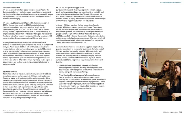
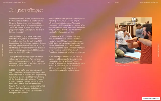
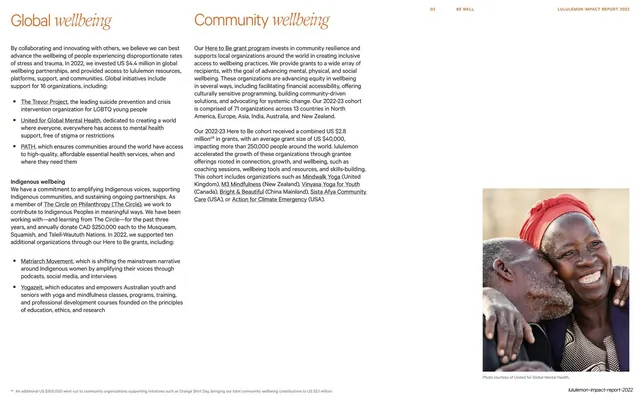
Two stacked program sections, "Global wellbeing" and "Community wellbeing", set as mixed serif-italic headings over multi-column copy with a warm portrait photo bottom-right.
Summary
A two-up program spread: "Global wellbeing" left and "Community wellbeing" right, each heading mixing an upright and italic serif word, over dense linked body copy, with a smiling portrait anchoring the lower right.
Visual description
Off-white field with the standard running header ("03 / BE WELL" center, report wordmark right). Two large section titles sit at the top, each combining a roman first word with an italic serif second word ("Global wellbeing", "Community wellbeing") in warm near-black. Below, narrow columns of small sans-serif body copy describe partner organizations, with many names set as orange underlined links (The Trevor Project, United for Global Mental Health, Matriarch Movement, Mindwalk Yoga, and others). The lower-right area holds a warm color photograph of two people embracing and smiling, captioned "Photo courtesy of United for Global Mental Health." A footnote runs along the bottom edge.
Key takeaway
The mixed roman-plus-italic serif heading as a recurring section signature, elegant and editorial without extra ornament. Running two parallel program columns side by side fits twice the content on one page while keeping a clear left/right read.
Reuse notes
A reusable pattern for impact or annual reports that need to credit many partners. Underlined orange links double as a visual rhythm through gray body text. The italic-serif heading depends on a quality serif with a real italic; it falls flat in a default system font.
From this deck: Global and Community wellbeing, twin italic-serif headings
View deck