Preview image. Unlock full-res
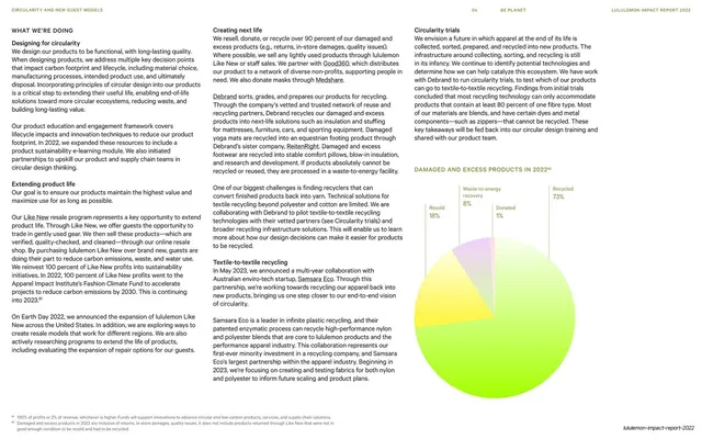
A dense three-column circularity text spread with two small labeled pie charts stacked on the right showing damaged and excess product outcomes.
Summary
A text-dense circularity page: three columns of body copy headed "WHAT WE'RE DOING" with subheads (Designing for circularity, Extending product life, Creating next life), balanced by two small labeled pie charts stacked in the right column.
Visual description
A light page with a thin running header. Three justified columns of body text walk through circularity sub-programs, each introduced by a small bold subhead, with green inline links and footnote superscripts. The right column carries two compact pie charts: an upper "DAMAGED AND EXCESS PRODUCTS IN 2022" pie with green, yellow and orange segments and percentage callouts (Recycled, Resold, Donated, Waste-to-energy recovery), and a lower green-and-cream pie beneath more text. The pies are small and sit inline with the copy rather than dominating. The slug wordmark sits bottom-right.
Key takeaway
Embedding small pie charts directly into a text column as inline evidence, rather than as a hero graphic, so the data supports the prose at the exact point it is referenced. It keeps a heavily textual page from reading as an unbroken wall.
Reuse notes
Good for the explanatory pages of a report where charts are supporting detail, not the headline. The inline-chart approach scales to several small charts per spread. Keep chart palettes consistent with the brand so they read as part of the page, not pasted in.
From this deck: Designing for circularity, three-column text with pie charts
View deck