Preview image. Unlock full-res
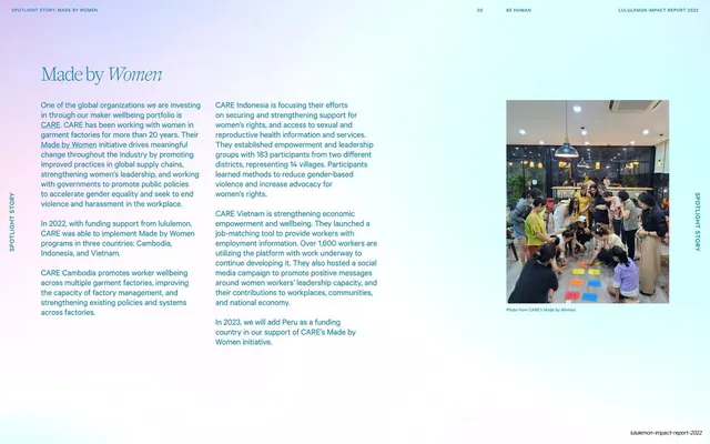
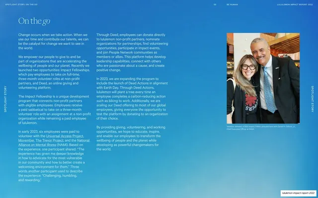
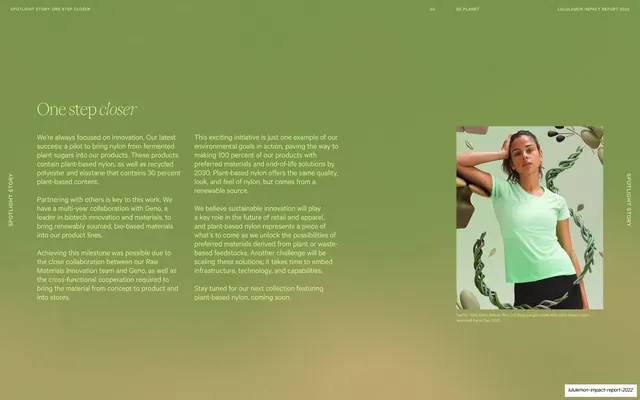
Pale lavender-blue spotlight-story page with a serif-italic accent title, three columns of body copy, a captioned community photo, and vertical sidebar labels.
Summary
A Spotlight Story on the Made by Women CARE partnership: a pale lavender-blue field carrying a serif-italic title, three columns of dark body copy, and a captioned community photo, flagged by vertical "Spotlight Story" labels.
Visual description
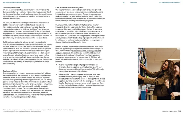
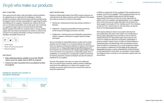
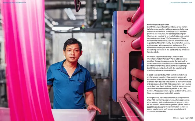
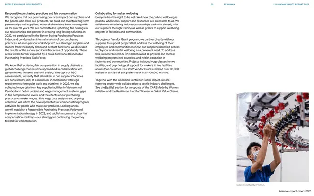
A soft, very light lavender-to-blue gradient fills the page. The title "Made by Women" sits upper-left, with "Women" in a serif italic. Three narrow columns of dark-grey body copy run beneath, describing the CARE programs in Cambodia, Indonesia, and Vietnam. A color photo of a group seated on the floor in a community workshop sits at the right, with a small caption "Photo from CARE's Made by Women." underneath. "SPOTLIGHT STORY" runs vertically up the far-left and far-right margins, and the header reads "SPOTLIGHT STORY: MADE BY WOMEN / 02 BE HUMAN / LULULEMON IMPACT REPORT 2022".
Key takeaway
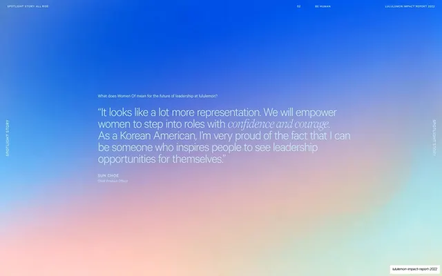
The third spotlight variant: a very pale gradient that lets dark body text sit directly on it, proving the story-page system flexes from saturated blue to near-white while keeping the same serif-italic title and vertical labels. Light-on-light is a softer register for sensitive, community-focused stories.
Reuse notes
Reach for this lighter spotlight treatment when the subject calls for a calm, understated tone rather than bold color. The consistent title lockup, vertical labels, and captioned photo keep it in the same family as the other stories. On a pale background switch body copy to dark grey for contrast; reserve the gradient versions for higher-energy features.
From this deck: Made by Women spotlight story
View deck







More like this


Keep what you find
A free account saves references to boards and can send you a weekly email of picks based on what you save.
To see every result, go Pro.