Preview image. Unlock full-res
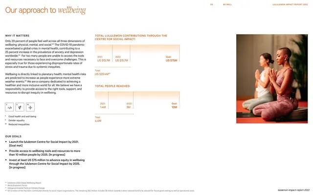
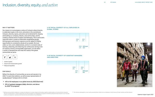
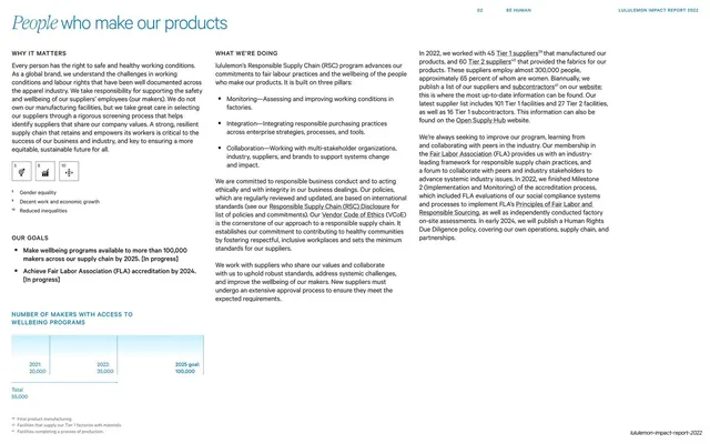
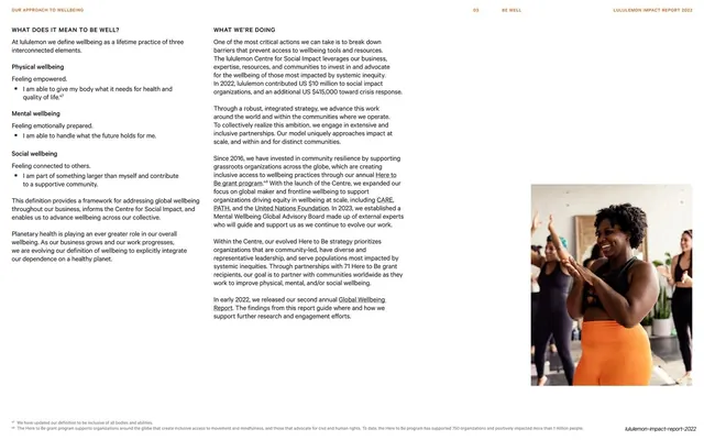
Light detail page with a mixed sans/serif-italic headline, a Why It Matters / Our Goals column, SDG icons, two faint bar charts, and a meditation photo.
Summary
The Our Approach to Wellbeing topic page: the standard report grammar again, a mixed sans/serif-italic headline over a Why It Matters / Our Goals column with SDG icons, two faint bar charts of contributions and people reached, and a meditation photo at right.
Visual description
A white page headlined "Our approach to wellbeing", with "wellbeing" in a serif italic. The left column runs "Why It Matters", a row of three numbered SDG icon tiles, and an "Our Goals" list with three bold bullets. The center holds two warm-toned pale bar charts, "Total lululemon contributions through the Centre for Social Impact" and "Total people reached", each comparing 2021 and 2022 values to a goal with totals beneath. A color photo of two people meditating sits at upper right. The thin "03 BE WELL / LULULEMON IMPACT REPORT 2022" header and bottom footnotes frame the page.
Key takeaway
The topic-page template carried into the new chapter, the same headline lockup, left context-and-goals rail, SDG icons, two understated charts, and one photo, but the chart fills shift to the chapter's warmer palette. Consistency of structure with a quiet color cue is the whole system.
Reuse notes
The default content page for any report section, here opening the Be Well chapter. Keep the left rail and chart styling identical to the other topic pages so the document reads as one; let only the accent color and photo change per chapter. Back the soft charts with explicit totals so the figures stay clear.
From this deck: Our approach to wellbeing detail page
View deck















More like this



Keep what you find
A free account saves references to boards and can send you a weekly email of picks based on what you save.
To see every result, go Pro.