Preview image. Unlock full-res
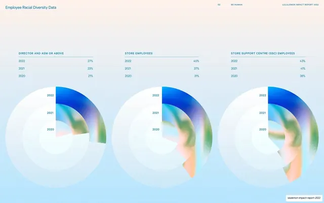
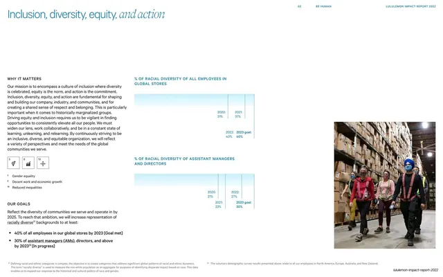
Light data spread with three large iridescent radial gauge charts comparing racial-diversity percentages across employee groups for 2020 to 2022.
Summary
A data spread on a pale-blue field: three large iridescent radial gauge charts, one per employee group, each stacking concentric 2020-2022 arcs above a small percentage table.
Visual description
A soft white-to-pale-blue background. Three columns each pair a small all-caps title and a tidy percentage table ("Director and ASM or Above", "Store Employees", "Store Support Centre (SSC) Employees") over a big radial gauge. Each gauge is built from three nested partial rings labeled 2022, 2021, 2020, filled with the deck's signature blue-green-peach iridescent gradient and fading into the pale background. The figures rise year over year (for example 21/23/27 percent and 31/37/40 percent). The thin "02 BE HUMAN / LULULEMON IMPACT REPORT 2022" header runs across the top.
Key takeaway
Treating data visualization as a brand surface: the radial gauges reuse the report's iridescent render palette instead of flat corporate colors, so the charts feel of a piece with the section openers. Pairing each gauge with a plain number table gives both an at-a-glance shape and exact values.
Reuse notes
Good when you want a few headline metrics to feel designed rather than spreadsheet-like, especially year-over-year comparisons. The gradient-filled rings are decorative, so always back them with an explicit value table for accuracy. Works on a light background where the translucent fills can fade out cleanly.
From this deck: Employee racial diversity data radial charts
View deck







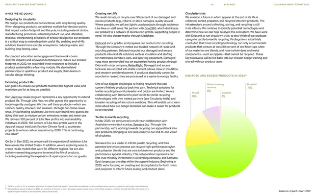
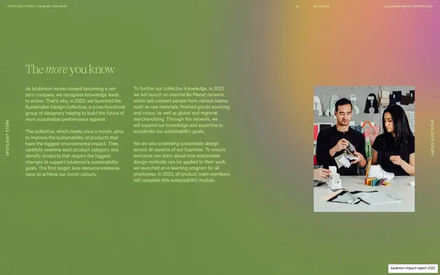
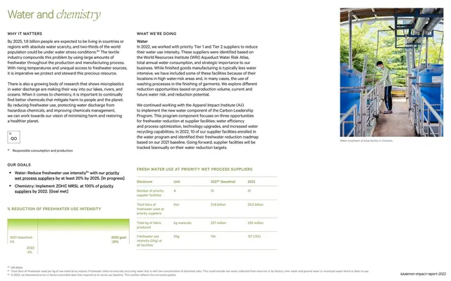

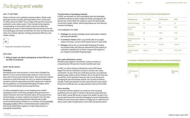
More like this





Keep what you find
A free account saves references to boards and can send you a weekly email of picks based on what you save.
To see every result, go Pro.