Preview image. Unlock full-res
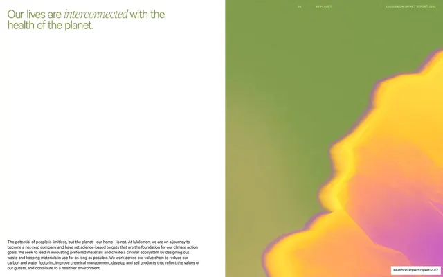
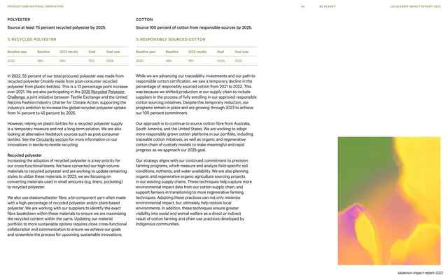
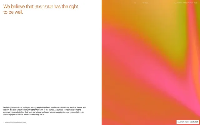
Split statement spread with a mixed sans/serif-italic headline and footer paragraph on a white left page and a full-height warm orange-pink gradient on the right.
Summary
The Be Well chapter's statement spread: a short statement on a white left page, headline at top and a paragraph at the bottom, beside a full-bleed warm orange-to-pink iridescent image on the right.
Visual description
The left two-thirds is white. The headline "We believe that everyone has the right to be well." sits at the top left in warm orange, with "everyone" set in a serif italic. The middle is left empty and a single small paragraph of body copy is parked at the lower-left edge. The right third is a full-height image of a glowing gradient running from amber-orange through hot pink with a chartreuse edge, softly out of focus. The thin running header crosses the image at top right: "03 BE WELL" and "LULULEMON IMPACT REPORT 2022".
Key takeaway
The mirror of the earlier Be Human statement spread, identical layout (top headline, bottom paragraph, full-height image on the right) but recolored to the warm Be Well palette. Reusing the exact spread with a swapped image keeps chapters consistent while giving each its own temperature.
Reuse notes
Pair this directly after a chapter opener as a one-sentence thesis page. The large white void is intentional, do not fill it. Match the gradient image to the chapter's color identity. The serif-italic emphasis word and bottom-anchored paragraph are the reusable mechanics; works on light backgrounds.
From this deck: Everyone has the right to be well statement spread
View deck