Preview image. Unlock full-res
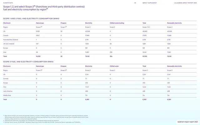
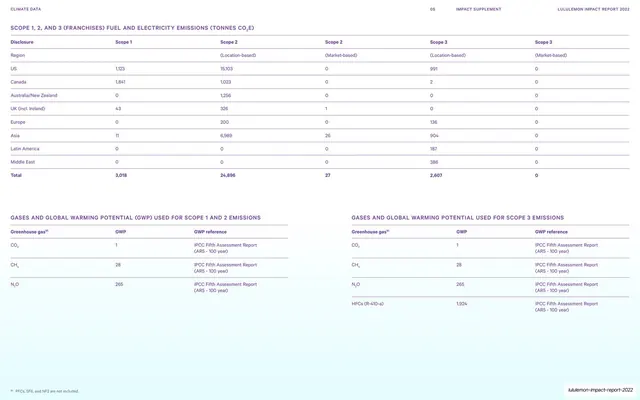
Two stacked wide data tables reporting Scope 1, 2, and select Scope 3 fuel and electricity consumption in MWh, broken out by region.
Summary
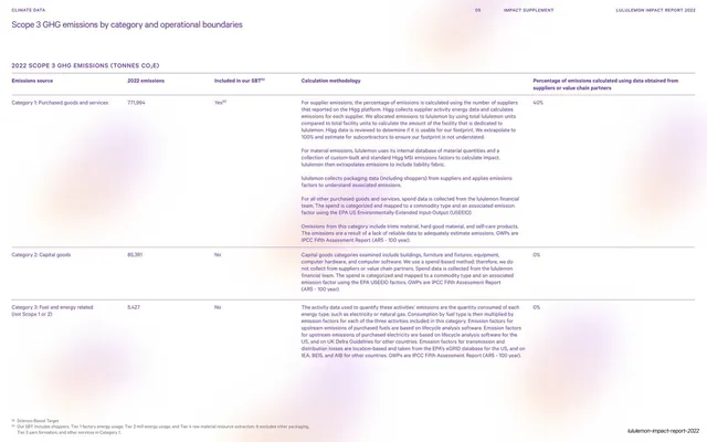
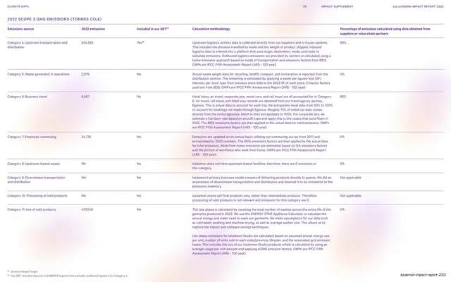
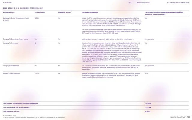
A pure data page: two wide multi-column tables of fuel and electricity consumption by region, one for Scope 1 and 2, one for Scope 3, each closed by a bold totals row.
Visual description
White 16:9 page. A two-line violet headline at top left, "Scope 1, 2, and select Scope 3 (franchises and third-party distribution centres) fuel and electricity consumption by region", with small superscript footnote markers. A small all-caps subhead "SCOPE 1 AND 2 FUEL AND ELECTRICITY CONSUMPTION (MWH)" introduces the first table: seven columns (Disclosure, Natural gas, Propane, Electricity, Chilled water/cooling, Total, Renewable electricity) with region rows (US, Canada, Australia/New Zealand, UK, Europe, Asia) on hairline rules and a bold violet Total row. A second identical table below covers Scope 3 by region. Numeric values align right. Small footnotes sit at the bottom; a thin all-caps "CLIMATE DATA / 05 / IMPACT SUPPLEMENT / LULULEMON IMPACT REPORT 2022" runs across the top, slug footer bottom right.
Key takeaway
The discipline of a single accent color (violet) carrying headers, totals, and footnote markers across an otherwise black-on-white data page, so structure reads instantly without rules or shading. Bold totals rows as the only visual emphasis keep big tables calm.
Reuse notes
A direct template for GHG inventory, energy, or any quantitative-disclosure table in an ESG or annual report. The seven-column, region-row, bold-total pattern scales to many metrics. Pair with the methodology page (slide 74) and the emissions tables (slide 76). Needs right-aligned figures and consistent hairline spacing to hold together.
From this deck: Scope 1, 2, 3 energy consumption tables
View deck




































More like this





Keep what you find
A free account saves references to boards and can send you a weekly email of picks based on what you save.
To see every result, go Pro.