Preview image. Unlock full-res
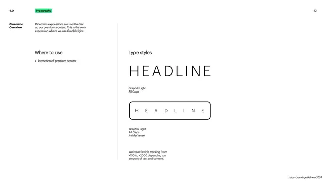
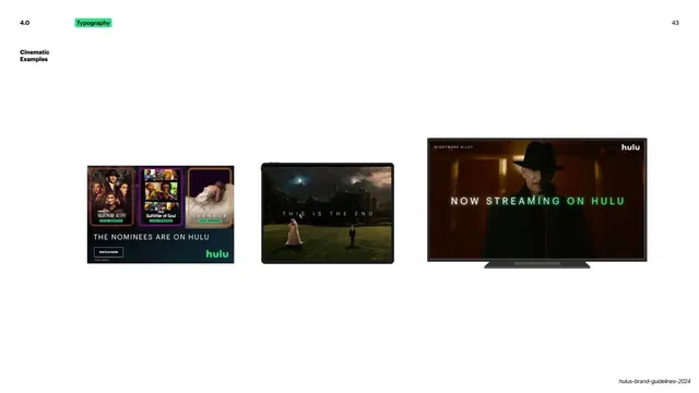
Cinematic type page showing Graphik Light all-caps headlines with wide tracking, plain and inside the Vessel.
Summary
A type-styles page for the cinematic voice, the only one using Graphik Light, shown as widely tracked all-caps headlines both plain and inside the Vessel.
Visual description
White slide with the green "Typography" tag top left, a bold "Cinematic Overview" label noting cinematic expressions dial up premium content and are the only place Graphik Light is used, plus a "Where to use: Promotion of premium content" note in the left column behind a vertical hairline. The right side, headed "Type styles", stacks two specimens: "HEADLINE" in thin light caps with very wide letter-spacing, captioned "Graphik Light, All Caps"; below it the same widely tracked "HEADLINE" inside a thin black rounded-rectangle Vessel, captioned "Graphik Light, All Caps, Inside Vessel". A small note at lower left reads that tracking is flexible from +150 to +2000 depending on amount of text and content.
Key takeaway
Reserving one light weight with exaggerated tracking exclusively for premium or cinematic content, and stating the tracking range explicitly (+150 to +2000). The airy letter-spacing alone signals a more elevated register without changing the typeface family.
Reuse notes
A good pattern for differentiating a premium tier within one type system through weight and tracking rather than a new font. Wide tracking needs short copy to stay legible. Reusable wherever a brand wants a quiet, cinematic voice.
From this deck: Hulu cinematic type styles
View deck













More like this






Keep what you find
A free account saves references to boards and can send you a weekly email of picks based on what you save.
To see every result, go Pro.