Preview image. Unlock full-res
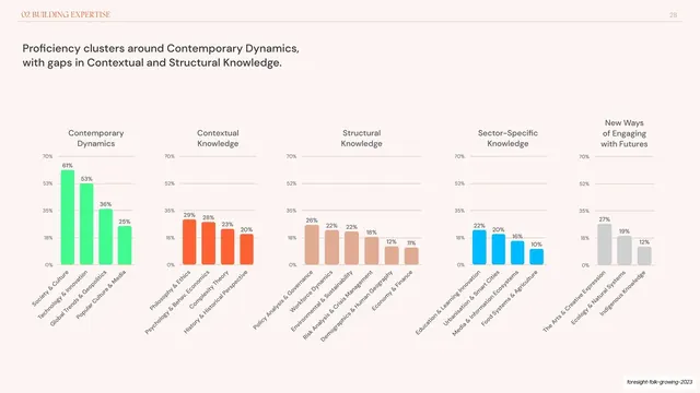
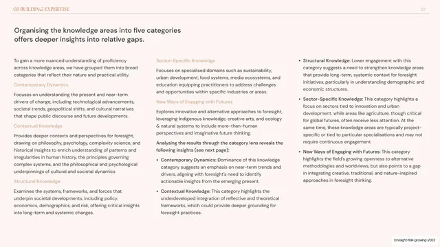
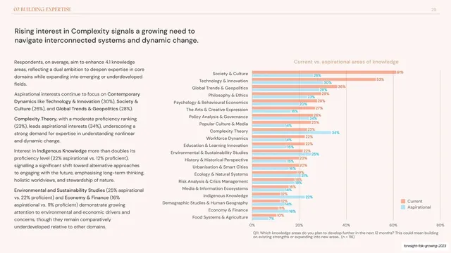
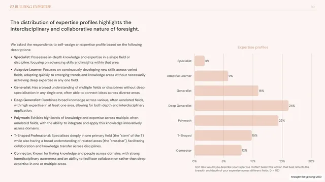
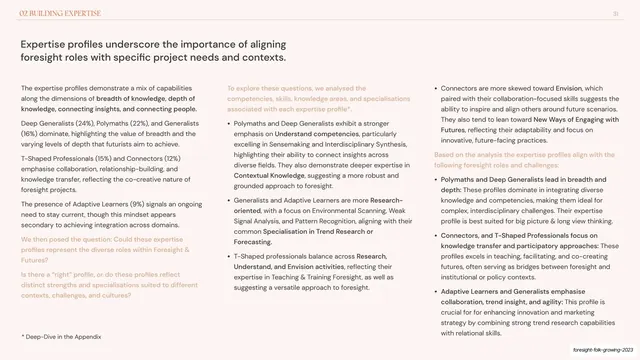
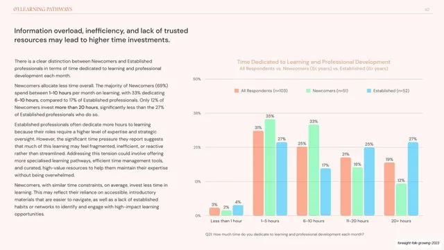
Full-width slide of five side-by-side vertical column-chart panels, one per knowledge category, each color-coded and labelled.
Summary
A chart-only slide visualising the five-category knowledge framework: five vertical column-chart panels in a row (Contemporary Dynamics green, Contextual orange, Structural tan, Sector-Specific blue, New Ways grey), each ranking its areas.
Visual description
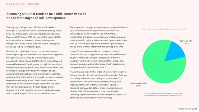
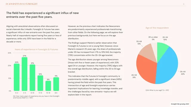
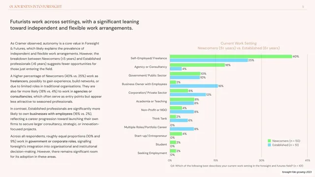
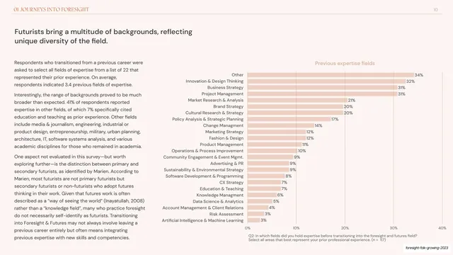
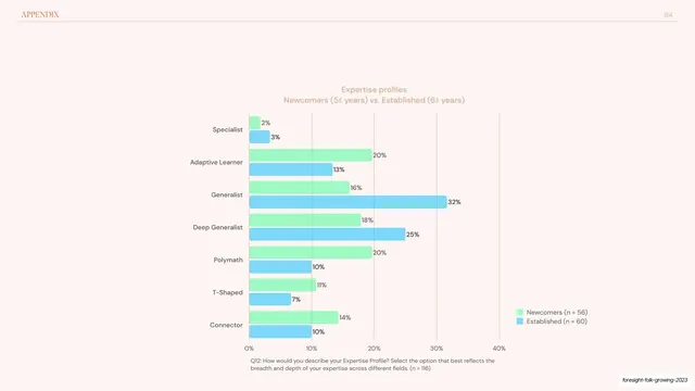
Warm off-white background; this slide drops the body text entirely. A two-line dark headline sits upper-left. Below, the full width carries five small column-chart panels side by side, each titled with a knowledge category and rendered in its own color: green, orange, tan, blue, grey. Each panel plots three to six vertical bars with percentage labels on top, sharing a common 0-70% y-axis so heights compare directly across panels. The leftmost green panel is tallest (61%), the rightmost panels shorter, making the "clusters here, gaps there" story visible at a glance. Grey question footnote at the bottom; deck-slug annotation bottom-right.
Key takeaway
Devoting a whole slide to five color-coded column panels with a shared axis, so the eye compares category profiles instantly with no legend and no prose. Vertical columns here (versus the horizontal bars elsewhere) signal "this is the summary comparison", and matching each panel's color to its earlier definition ties the system together.
Reuse notes
A clean way to close a multi-category analysis: define the categories in words, then show all of them at once as small column charts. Works full-bleed without text only when the headline already states the takeaway. Keep panel colors identical to wherever the categories were introduced so the deck stays legible end to end.
From this deck: Five-category proficiency column chart panels
View deck















More like this






Keep what you find
A free account saves references to boards and can send you a weekly email of picks based on what you save.
To see every result, go Pro.