Preview image. Unlock full-res
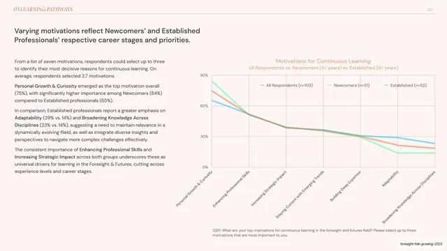
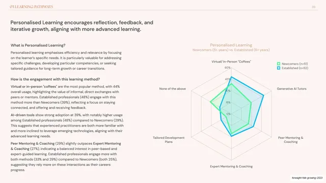
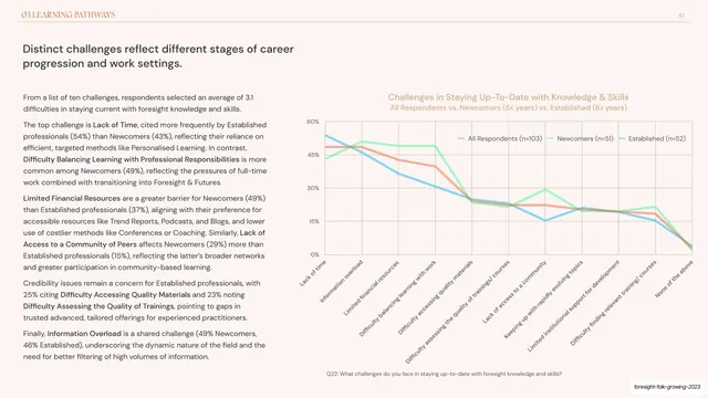
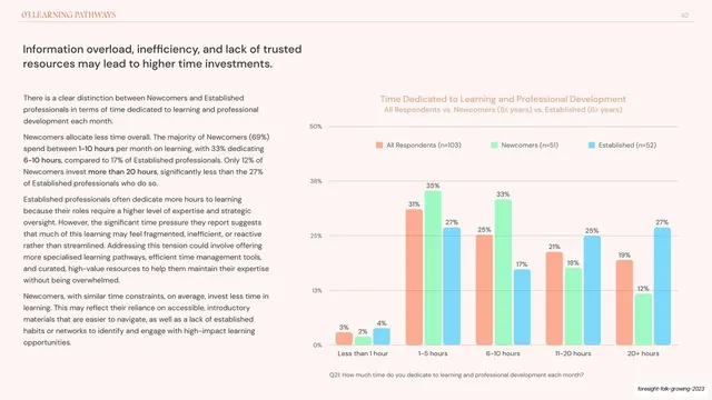
Two-column report slide pairing a left analysis with a right multi-line chart of three respondent cohorts ranked across seven learning motivations.
Summary
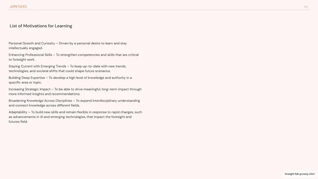
A Learning Pathways slide switching from radar to a three-series line chart, plotting all-respondents, newcomers, and established cohorts across seven ranked motivations for continuous learning.
Visual description
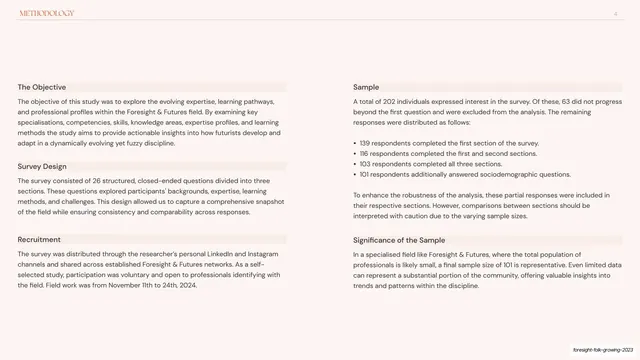
Pale pink-cream background with the orange "03 LEARNING PATHWAYS" running header and page number "40". A two-line dark sans-serif headline ("Varying motivations reflect Newcomers' and Established Professionals' respective career stages and priorities.") sits upper left over four short grey paragraphs with bolded terms. The right half is a wide line chart titled in soft orange with a y-axis from 0% to 90% and seven diagonally set x-axis labels (Personal Growth & Curiosity through Broadening Knowledge Across Disciplines). Three thin lines, orange (All Respondents), green (Newcomers), and cyan (Established), descend and cross from a high left peak; a three-item legend sits inside the plot and a grey Q20 survey-question footnote runs beneath.
Key takeaway
Mixing chart types within one chapter, radar for category profiles and a ranked line chart for a descending priority order, so each data shape gets the encoding that fits it. The diagonal axis labels keep seven long category names readable without shrinking the plot.
Reuse notes
Use a downward-sloping ranked line chart when the story is "what matters most to least" and you are comparing a few cohorts. Three lines is near the legible limit on a pale ground; bold the key labels in the prose to guide reading. Keep the survey-question footnote for provenance.
From this deck: Motivations for continuous learning line chart
View deck

















More like this






Keep what you find
A free account saves references to boards and can send you a weekly email of picks based on what you save.
To see every result, go Pro.