Preview image. Unlock full-res
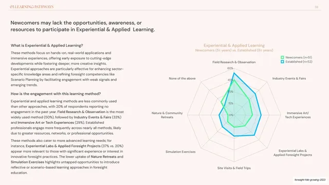
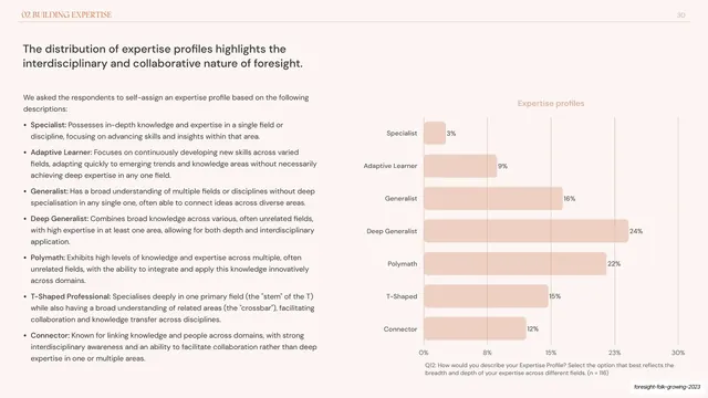
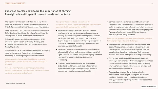
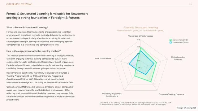
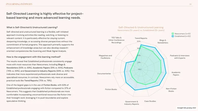
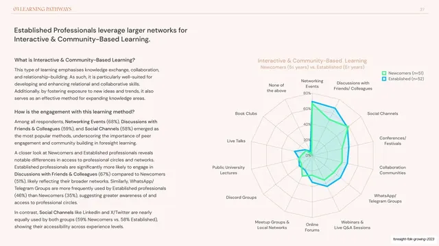
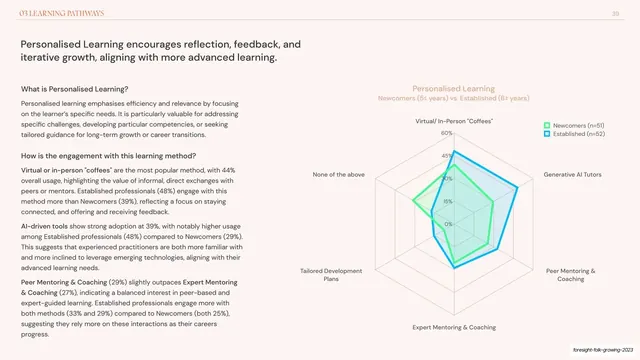
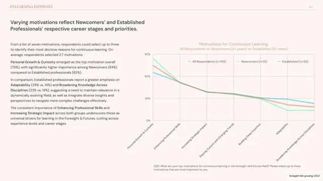
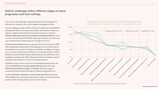
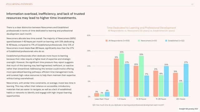
Two-column report slide with left text analysis and a right radar chart comparing newcomers and established practitioners across experiential and applied learning methods.
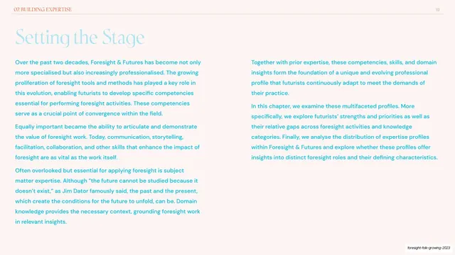
Summary
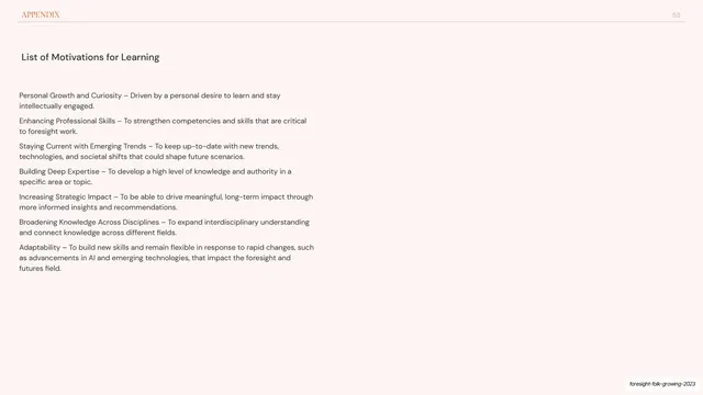
A content slide in the Learning Pathways chapter pairing a left analysis column with a right radar chart on experiential and applied learning, where the established cohort's polygon clearly encloses the newcomers'.
Visual description
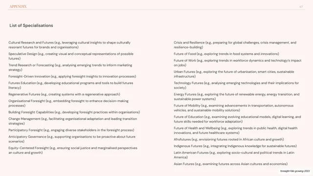
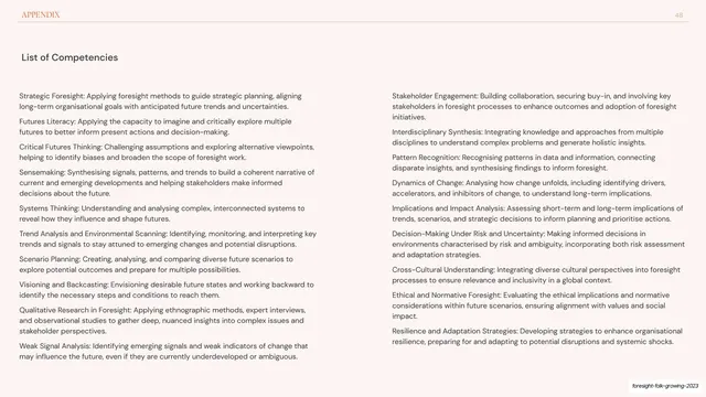
Pale pink-cream background with the orange "03 LEARNING PATHWAYS" running header and page number "38" on a hairline rule. A two-line dark sans-serif headline ("Newcomers may lack the opportunities, awareness, or resources to participate in Experiential & Applied Learning.") sits upper left, above two sub-headed paragraphs of small grey body copy with bolded key terms. The right half is an eight-spoke radar chart titled in soft orange (Field Research & Observation, Industry Events & Fairs, Immersive Art/Tech Experiences, Simulation Exercises, Nature & Community Retreats and others) over 0-60% rings. A cyan-outlined Established polygon visibly sits outside a smaller green-filled Newcomers polygon, with a two-item legend top right.
Key takeaway
Using the nested shapes of a radar chart to make a single point legible at a glance: the bigger cyan ring around the smaller green one instantly reads as "established do more." A good example of letting the chart geometry carry the headline's claim.
Reuse notes
Reuse when one segment dominates another across every dimension and you want that gap to be felt, not just read. Keep to two translucent series so the enclosure stays clear. Consistent with the sibling radar slides in this chapter.
From this deck: Experiential & applied learning radar chart
View deck



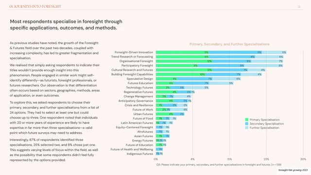

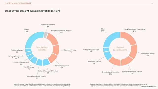
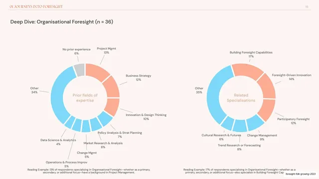
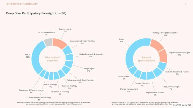
















More like this






Keep what you find
A free account saves references to boards and can send you a weekly email of picks based on what you save.
To see every result, go Pro.