Preview image. Unlock full-res
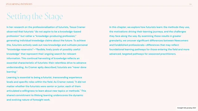
Text-only chapter intro with a large blue serif headline over two columns of matching blue body copy.
Summary
A text-only chapter introduction: an oversized blue serif "Setting the Stage" headline above two evenly set columns of body copy in the same blue.
Visual description
Blush-cream ground with a "01 JOURNEYS INTO FORESIGHT" running header at top-left and page number "6" at top-right on a hairline rule. The headline "Setting the Stage" runs large in a sky-blue serif. Below it, the prose is laid out in two equal columns in a humanist sans, tinted the same blue, discussing longstanding debates in the field. There is no chart or image; the slide is pure typography in a single blue-on-cream key.
Key takeaway
Using a monochromatic accent (here blue) across both the serif headline and the sans body so a text-only spread still feels designed and on-brand. It shows the deck can drop to plain prose between data slides without breaking rhythm.
Reuse notes
A clean default for narrative or framing pages that carry no data. The single-accent type treatment is the whole look, so pick an accent that stays readable at body size. Pairs naturally between a chapter divider and the first data slide.
From this deck: Setting the Stage two-column intro
View deck