Preview image. Unlock full-res
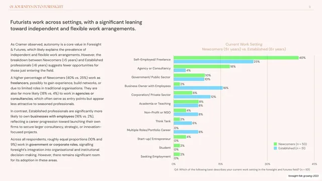
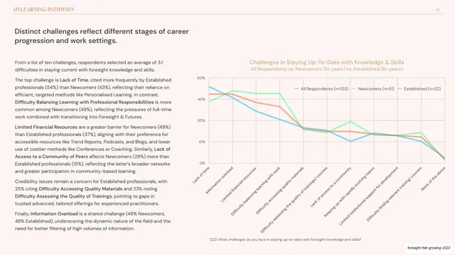
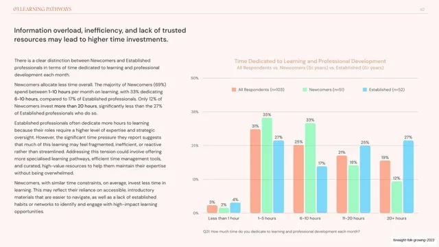
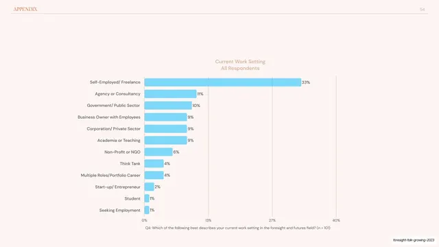
Data slide with three columns of copy beside a grouped green-and-blue horizontal bar chart comparing newcomers and established practitioners.
Summary
A comparison data slide: three columns of copy on the left and a grouped horizontal bar chart on the right comparing newcomers (green) against established practitioners (blue) across work settings.
Visual description
Blush-cream ground with the "01 JOURNEYS INTO FORESIGHT" header and page "9" on a hairline rule. The headline "Futurists work across settings, with a significant leaning toward independent and flexible work arrangements." runs in a dark sans, top-left. The left half holds three columns of body copy with a few bolded inline terms. The right half is a grouped horizontal bar chart titled "Current Work Setting: Newcomers vs. Established", listing roles (Self-Employed/Freelance, Agency or Consultancy, and so on) with paired green and blue bars and percentage labels, a small legend, and a grey question caption along the bottom axis.
Key takeaway
The paired-bar comparison for any "group A vs group B" finding, with a clear two-color legend (green newcomers, blue established) reused from the deck palette. Putting three tight copy columns opposite the chart lets a data-rich slide still carry a full written argument.
Reuse notes
Reach for this when comparing two cohorts across many categories. Horizontal bars handle the long category labels better than vertical ones would. Three columns of body is near the upper limit of comfortable density; keep the chart visually dominant so the eye lands there first.
From this deck: Work settings horizontal bar comparison
View deck
















More like this




Keep what you find
A free account saves references to boards and can send you a weekly email of picks based on what you save.
To see every result, go Pro.