Preview image. Unlock full-res
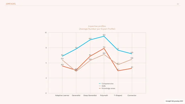
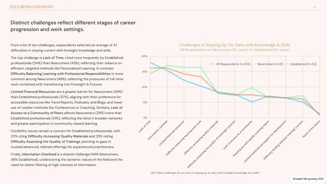
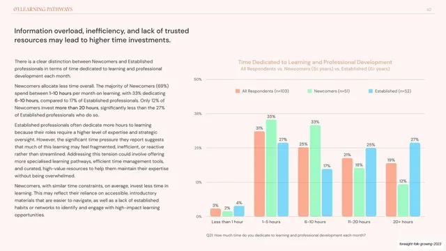
Appendix line chart tracking average competencies, skills, and knowledge areas across six expertise profiles in blue, tan, and orange lines.
Summary
An appendix data slide: a single three-line chart showing the average number of competencies, skills, and knowledge areas held by each of six expertise profiles, peaking at the Polymath profile.
Visual description
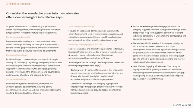
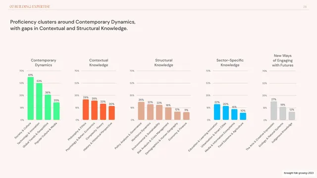
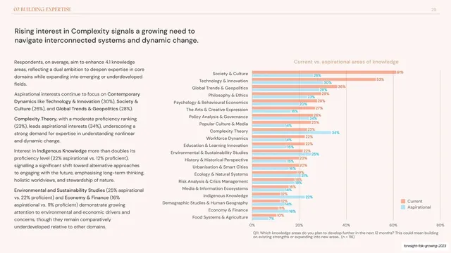
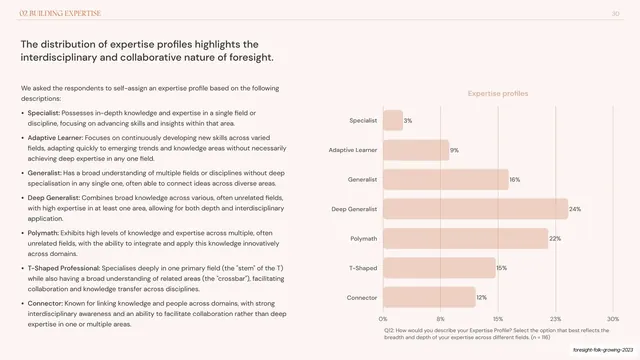
Pale warm-cream background, "APPENDIX" header and page number "62" on a hairline rule. A two-line salmon title ("Expertise profiles / Average Number per Expert Profile") is centered above the plot. The chart has a 0 to 10 y-axis and six x-axis categories (Adaptive Learner, Generalist, Deep Generalist, Polymath, T-Shaped, Connector). Three lines run across it, each point carrying an inline numeric label: a blue line (Competencies, rising 6.1 to a 9.4 peak at Polymath then falling to 6.5), a tan line (Skills, 5.5 to 6.4 peak), and an orange line (Knowledge areas, 4.5 to 7.4 peak). All three share the same hump shape, cresting at Polymath and dipping at Generalist and T-Shaped. A small three-row legend sits lower-center; faint gridlines back the plot.
Key takeaway
Three lines that share a silhouette make the takeaway ("Polymaths carry the most of everything") readable in one glance. Labeling every data point inline means the chart needs no axis cross-referencing, and keeping the three series in the deck's house blue/tan/orange ties it to the rest of the report.
Reuse notes
Line charts suit ordered or ranked categories where the trend across them matters; here the profiles read as a rough complexity gradient, so the lines tell a story. If your x categories are unordered, a grouped bar is usually clearer. Reuse the inline-label, house-color, single-chart treatment for any "metric across profiles" backmatter slide.
From this deck: Expertise profiles multi-line chart
View deck




















More like this








Keep what you find
A free account saves references to boards and can send you a weekly email of picks based on what you save.
To see every result, go Pro.